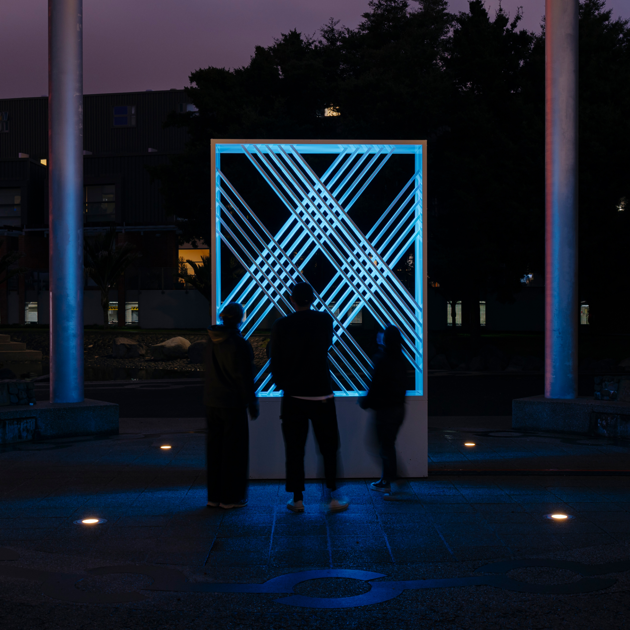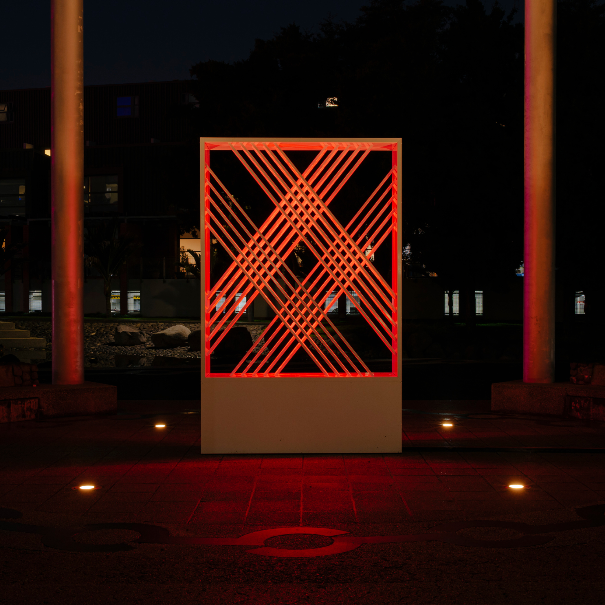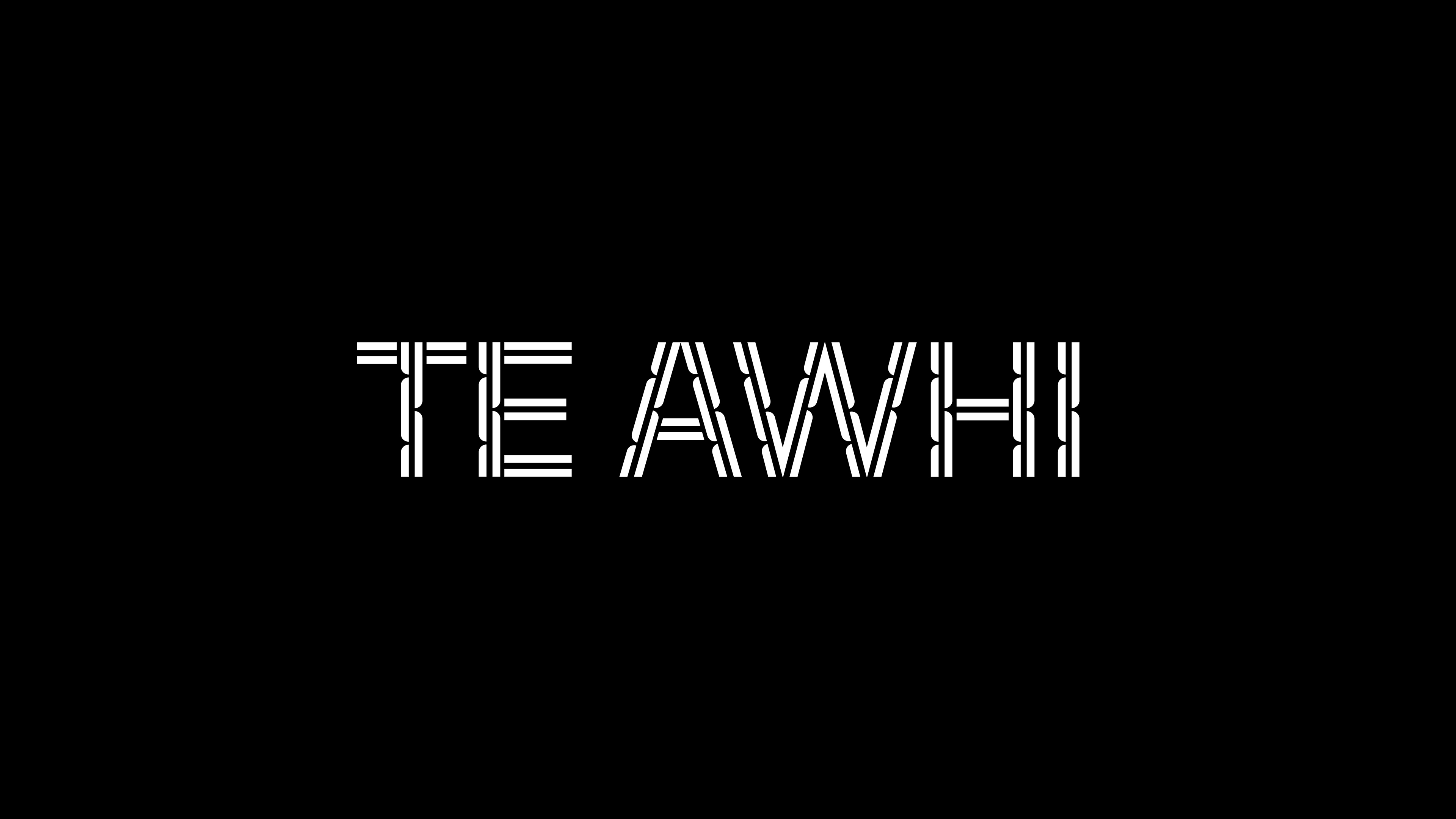
Te Awhi
Te Awhi is a Māori mental health service provider in the Waikato and Whangārei regions. They’re focus is on individual and whānau rehabilitation and wellbeing through holistic Māori Hauora methods.
The brief was to rebrand the organisation and roll out all business communication pieces in a manner that better reflects their philosophy and the people they serve.
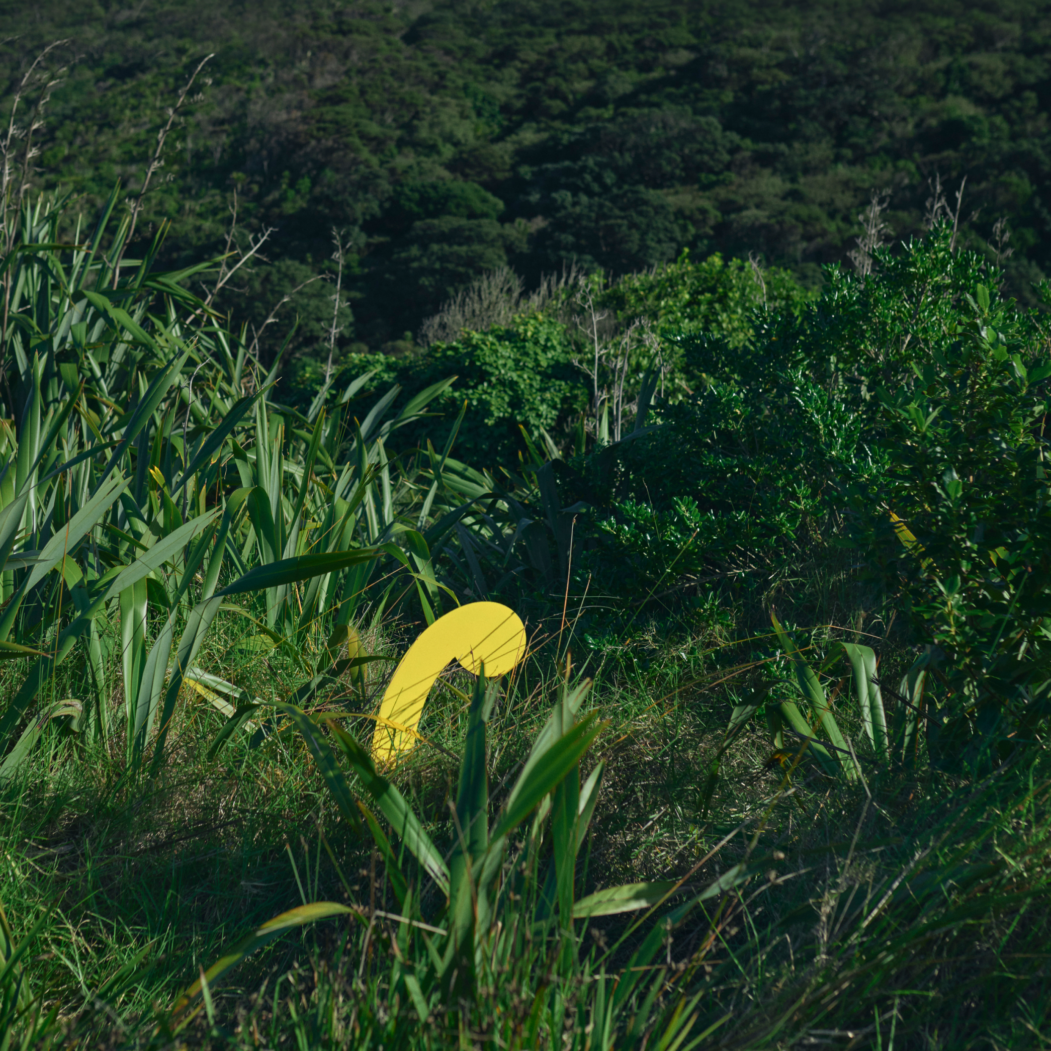
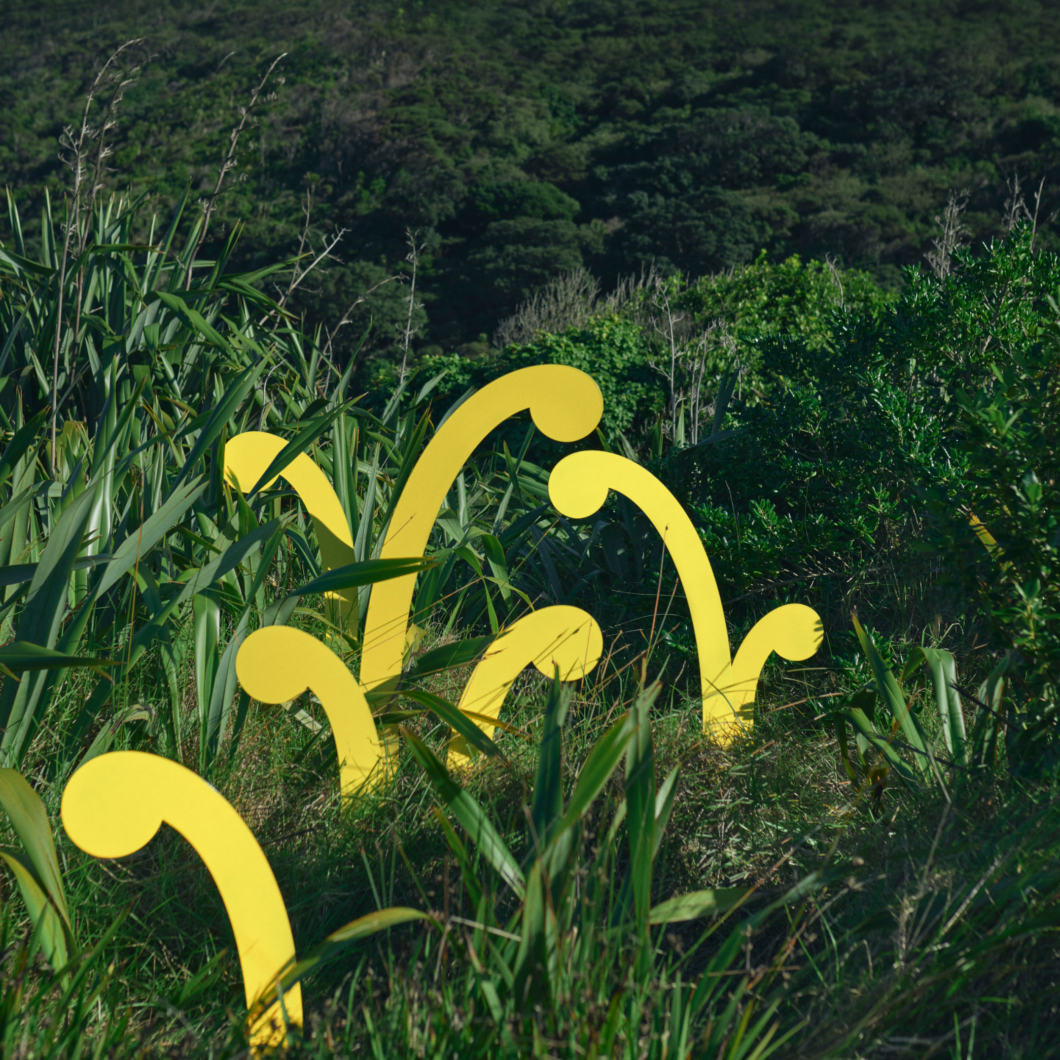
At the core of Te Awhi’s philosophy is the metaphor of Pā Harakeke (flax plantations). Pā Harakeke are multi-generational. The younger, newer blades of harakeke grow from the centre, surrounded and protected by older, more experienced generations. An eco-system of support and nurturing.
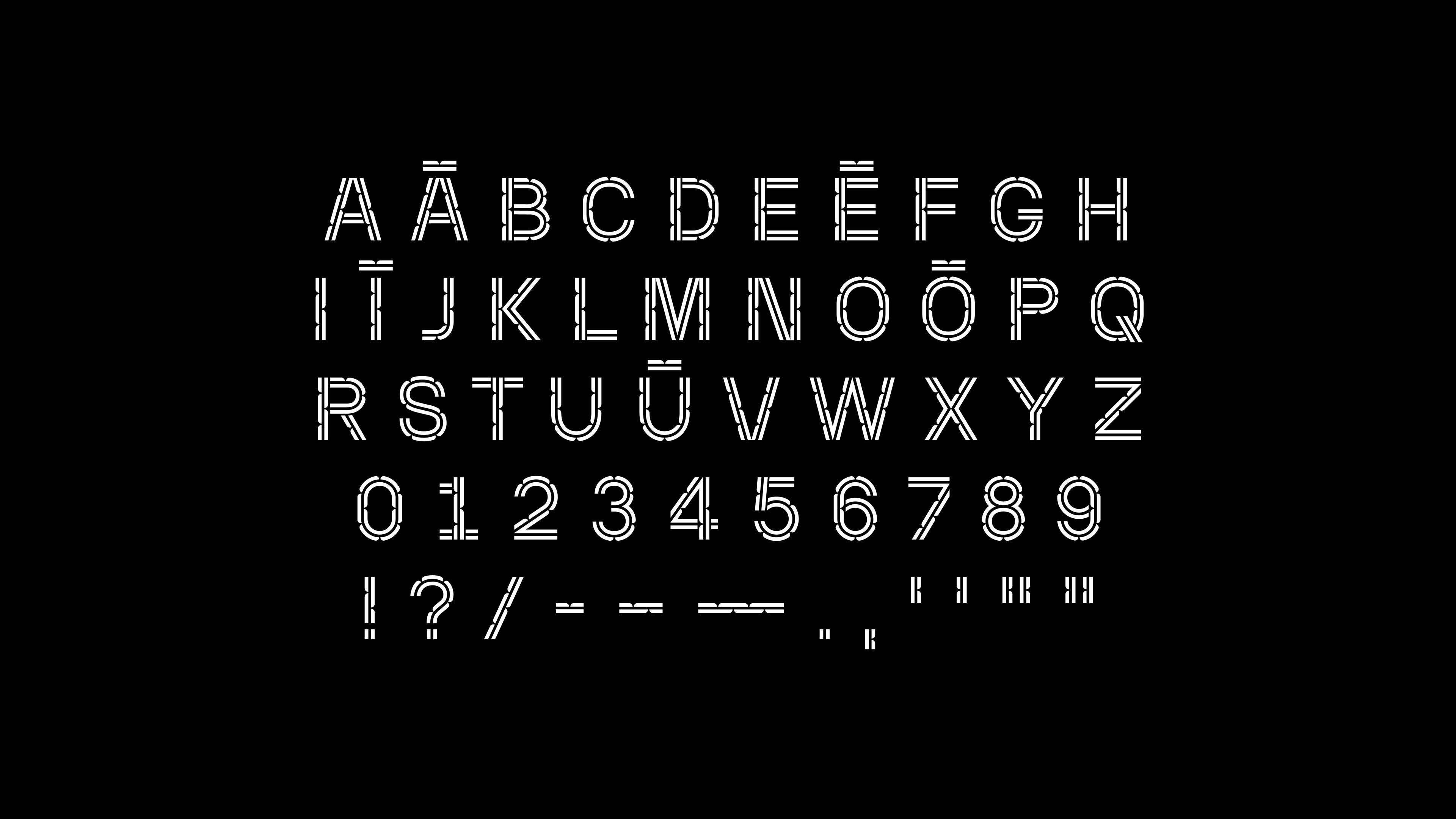

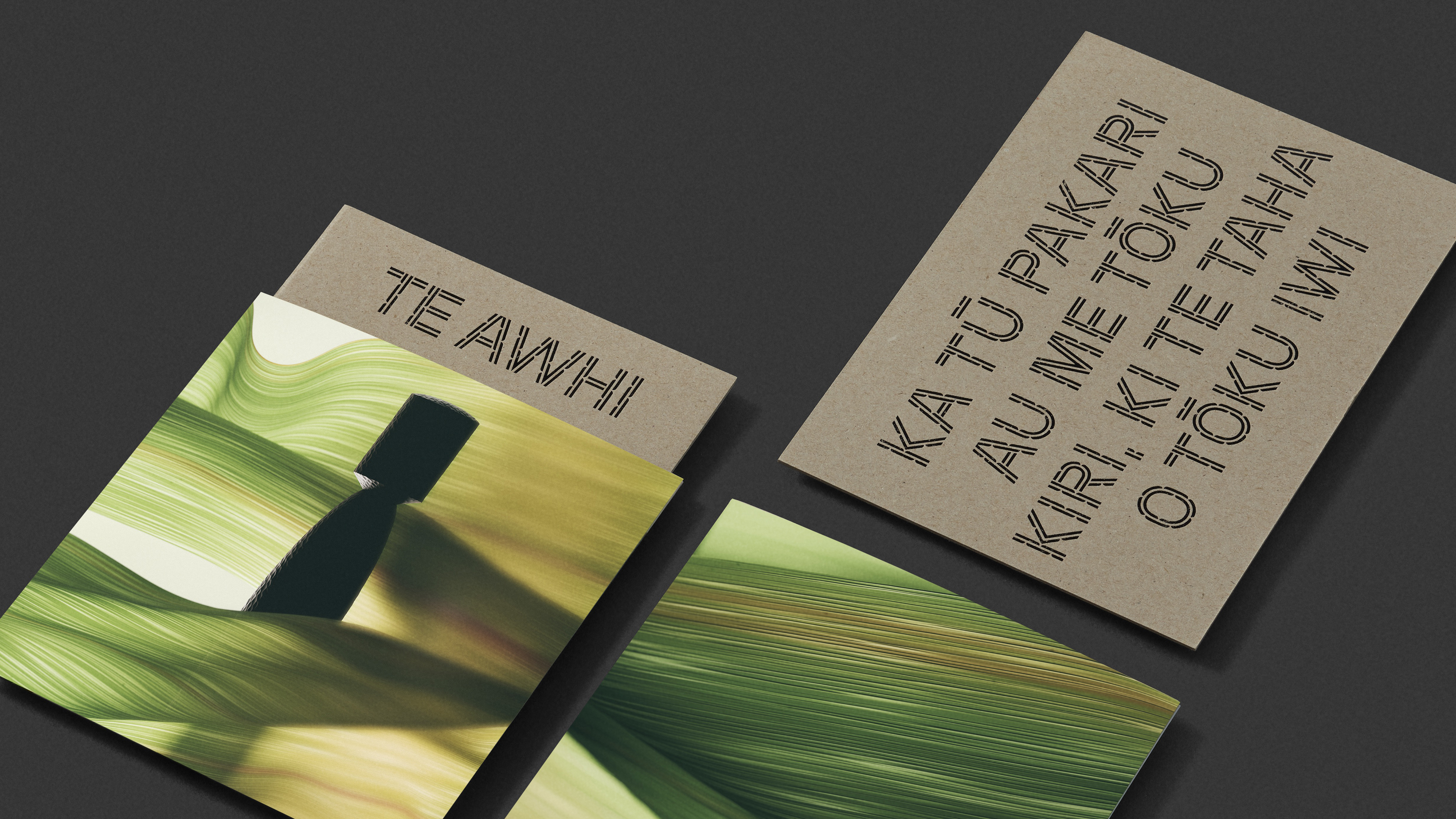
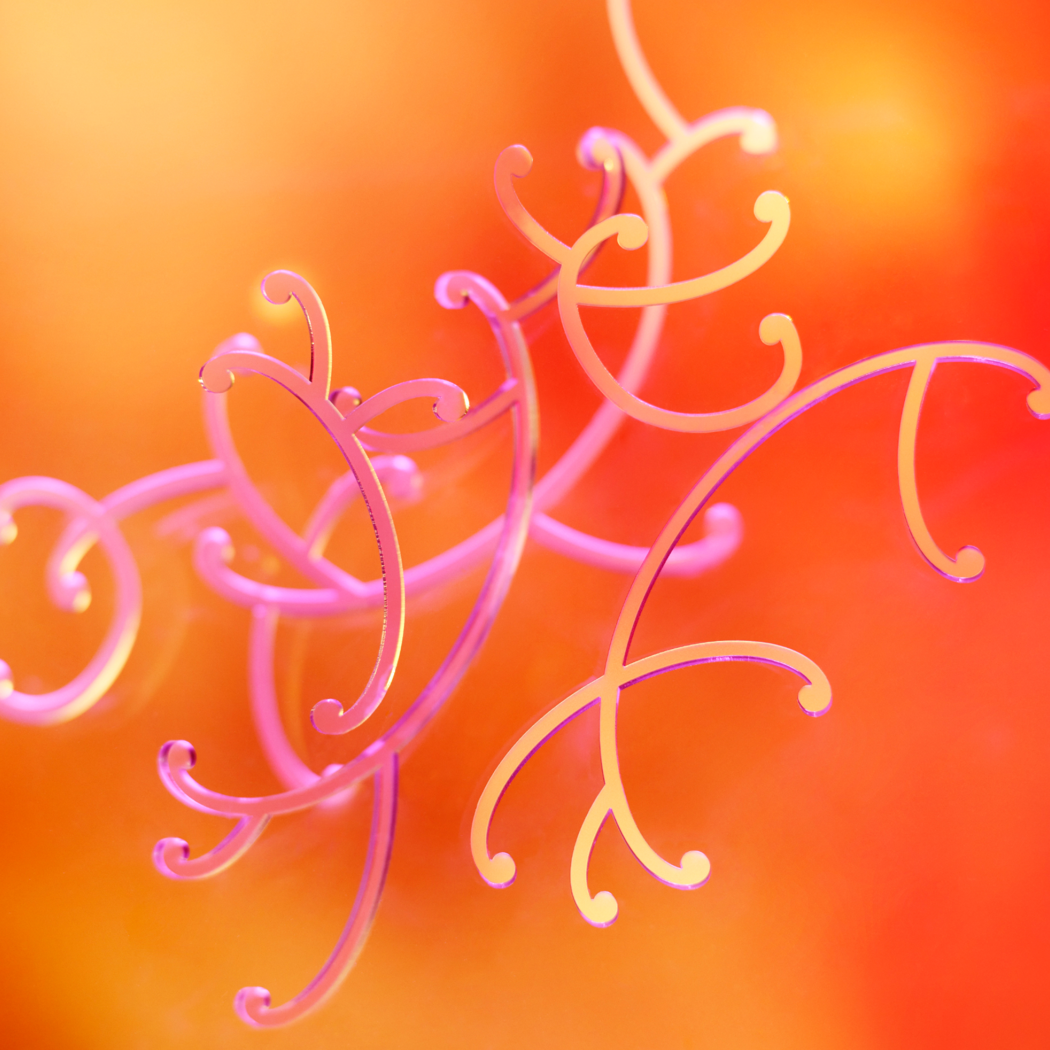
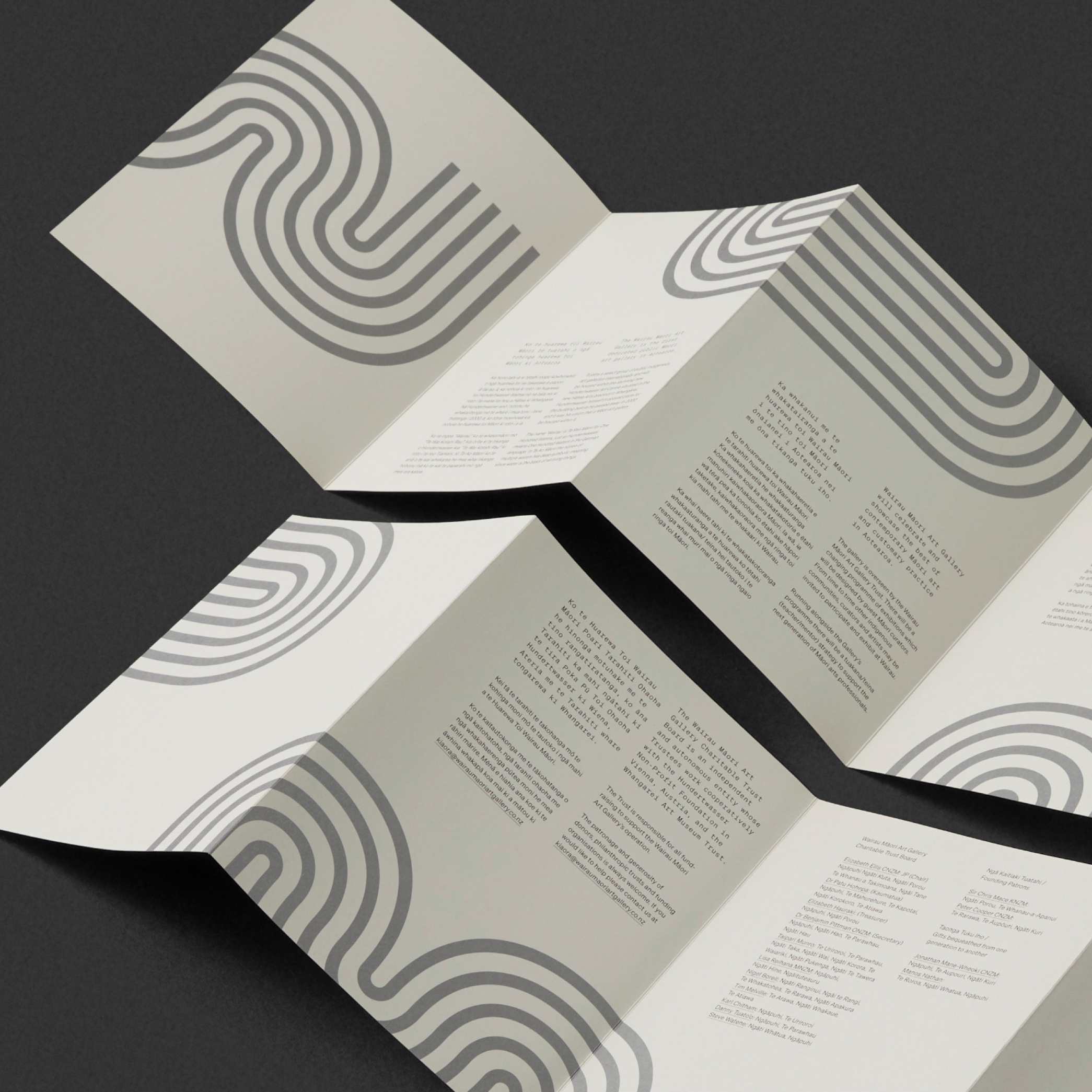
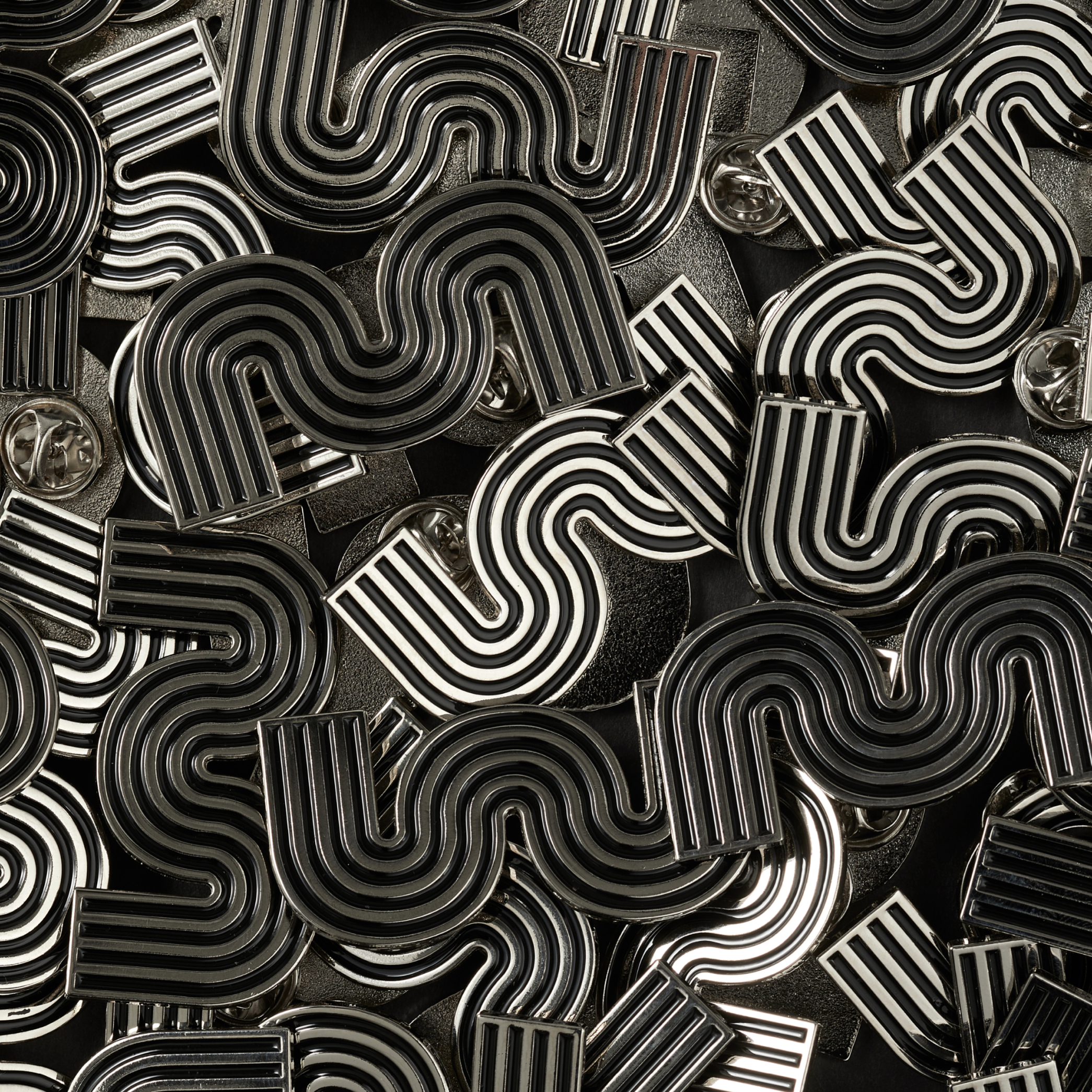
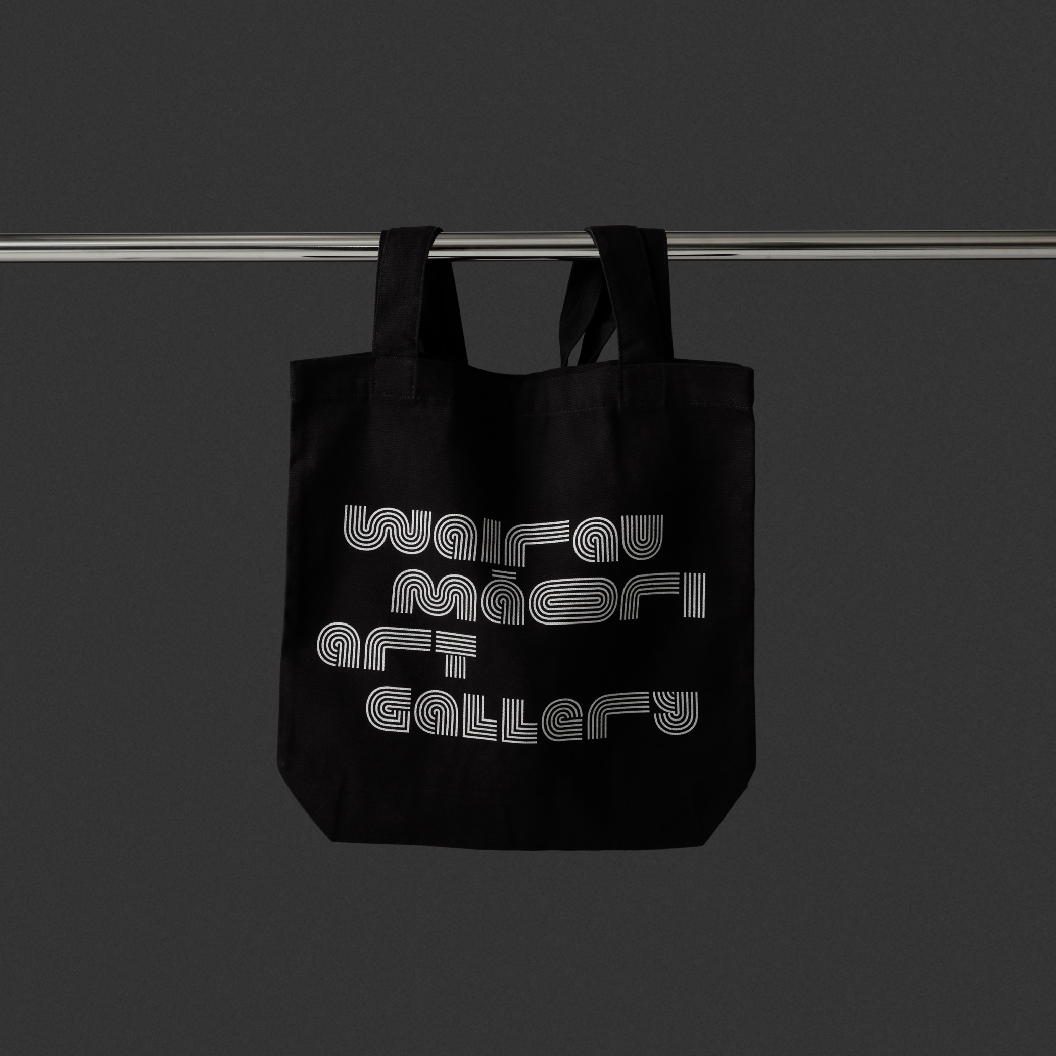
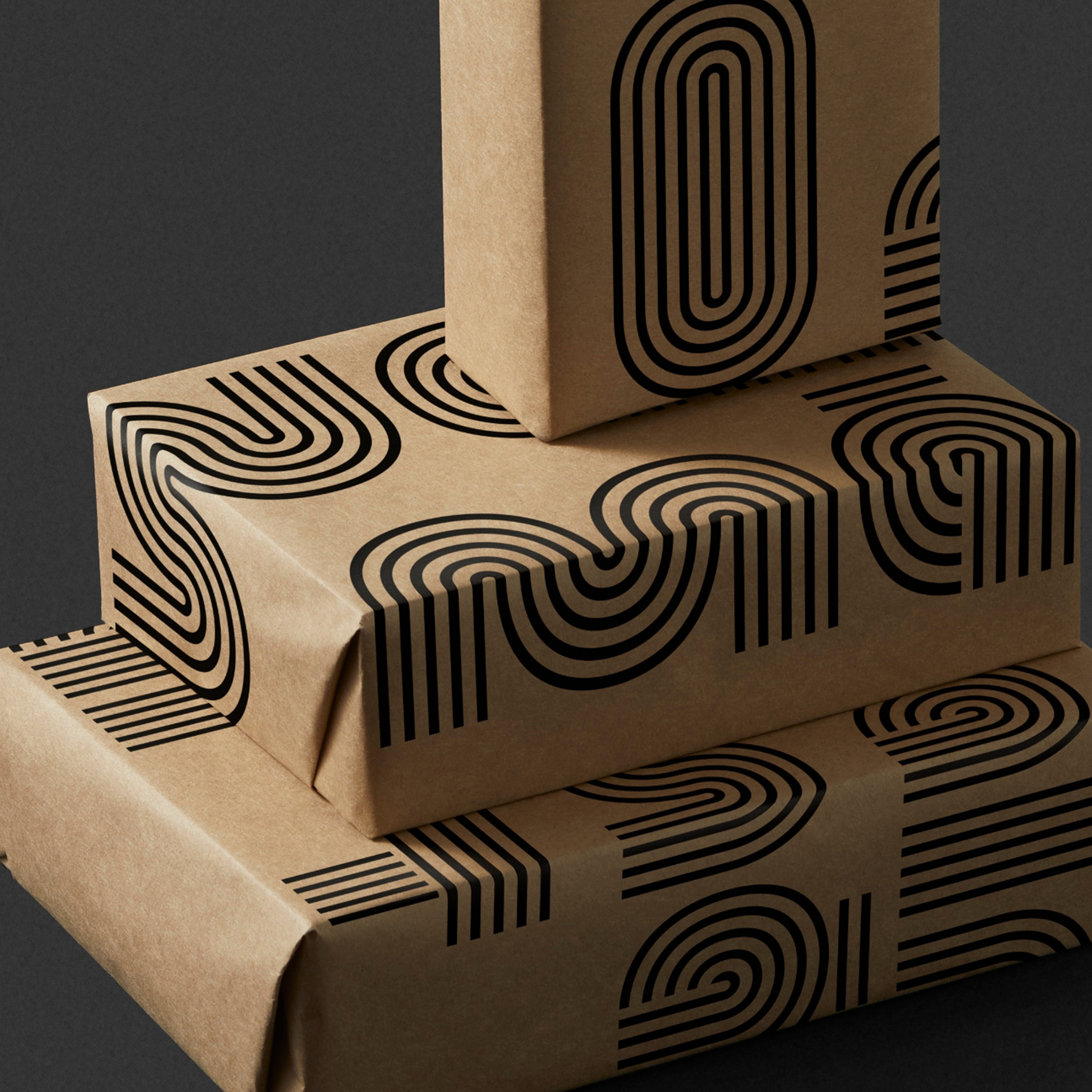
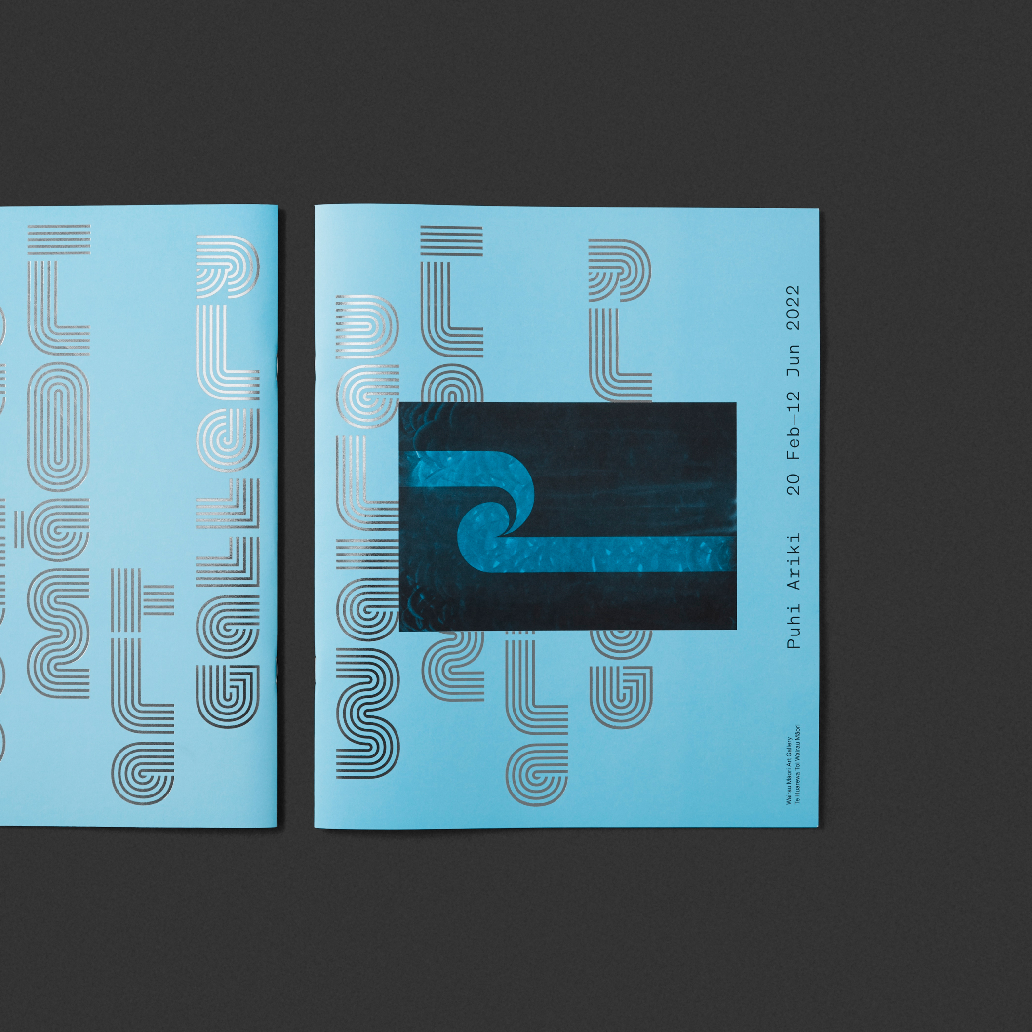
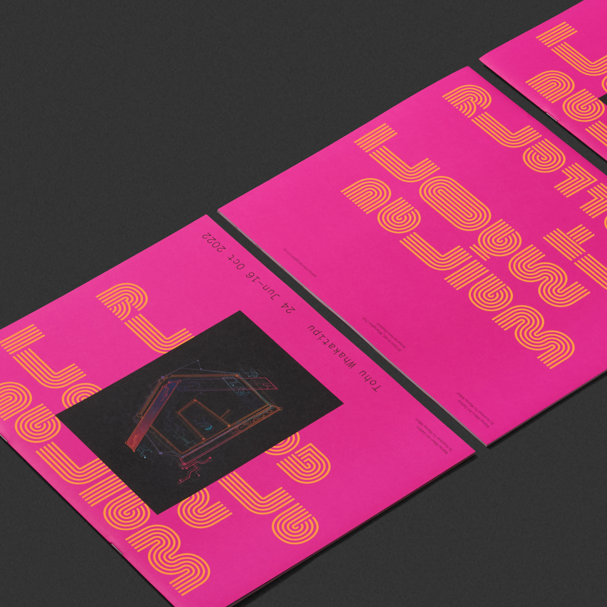
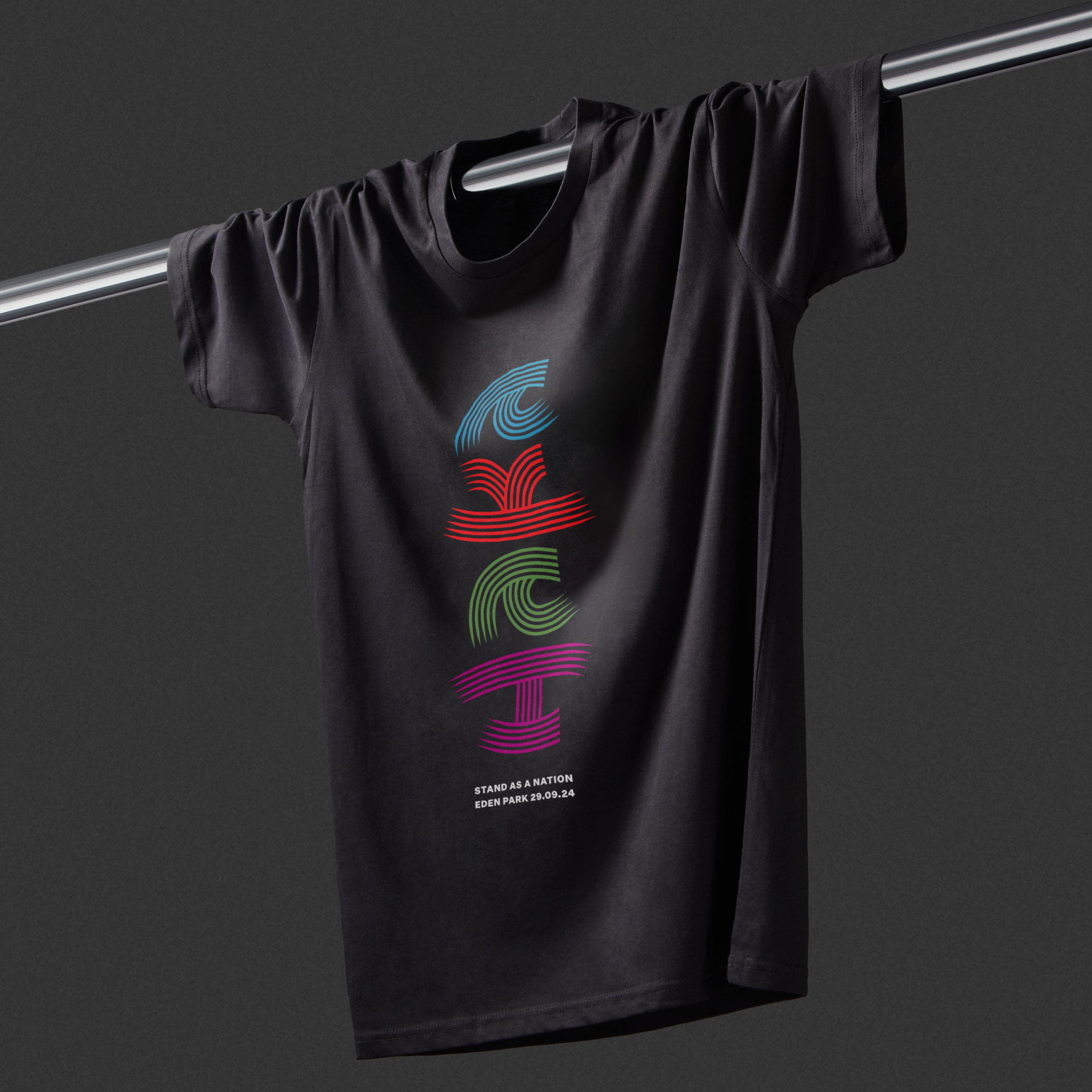
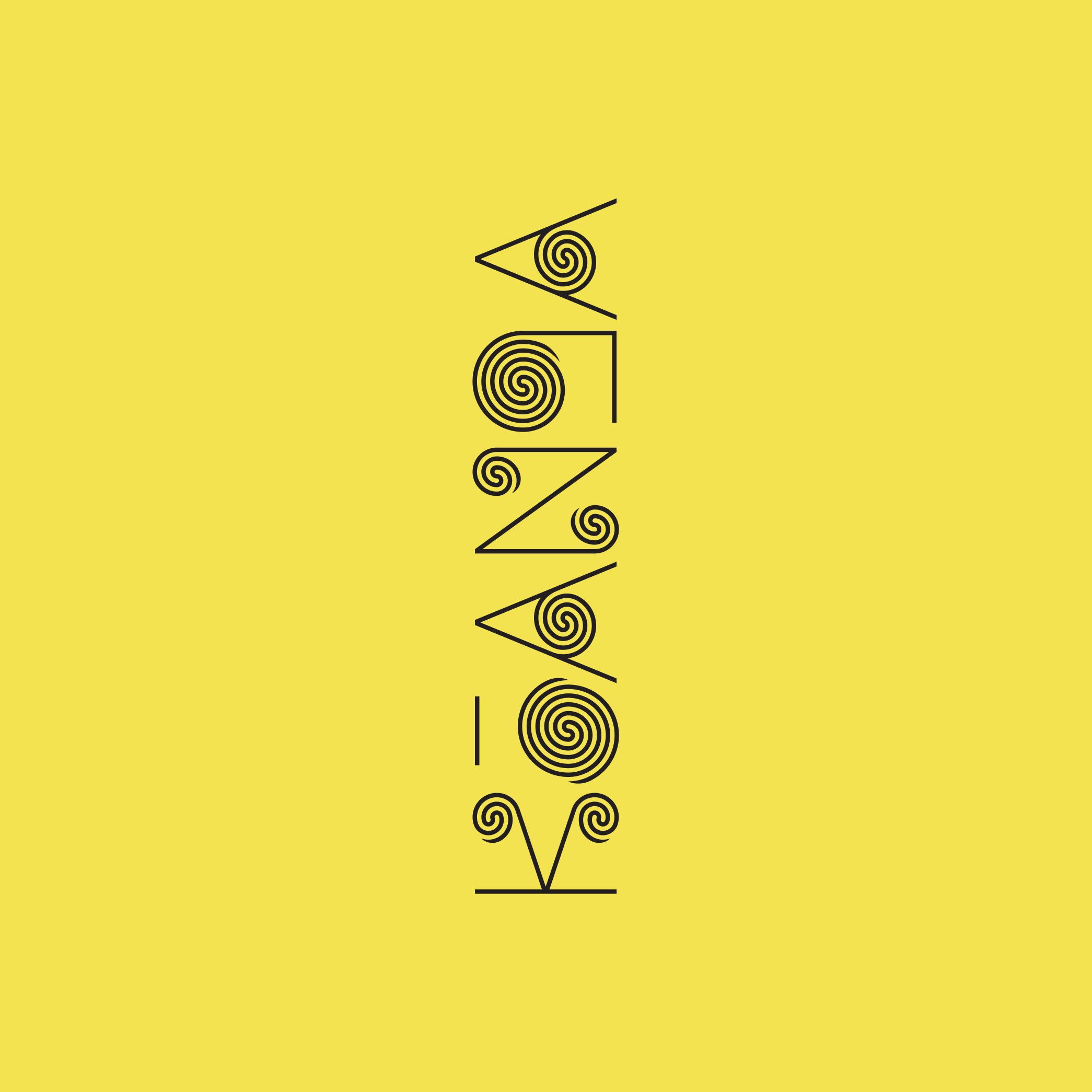
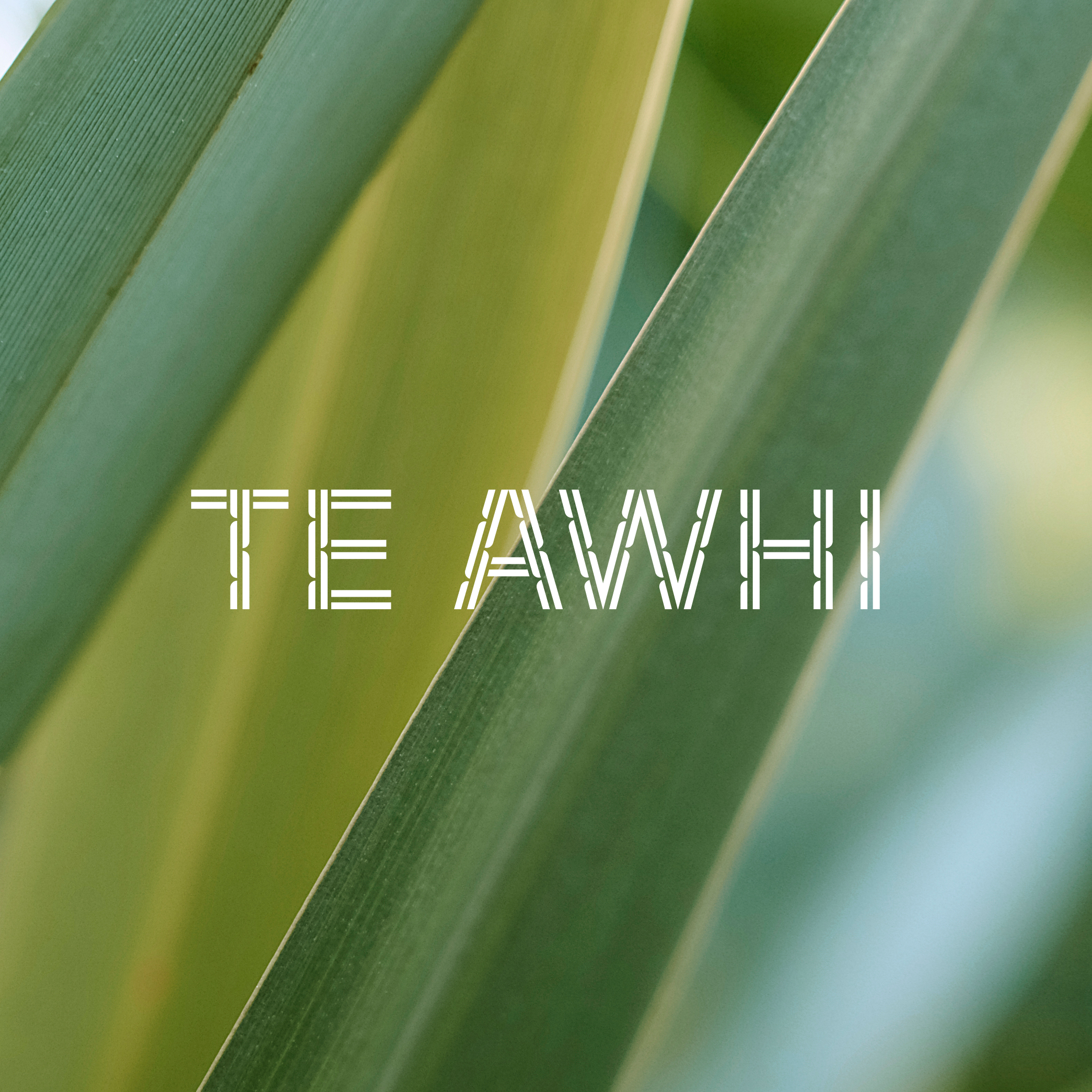
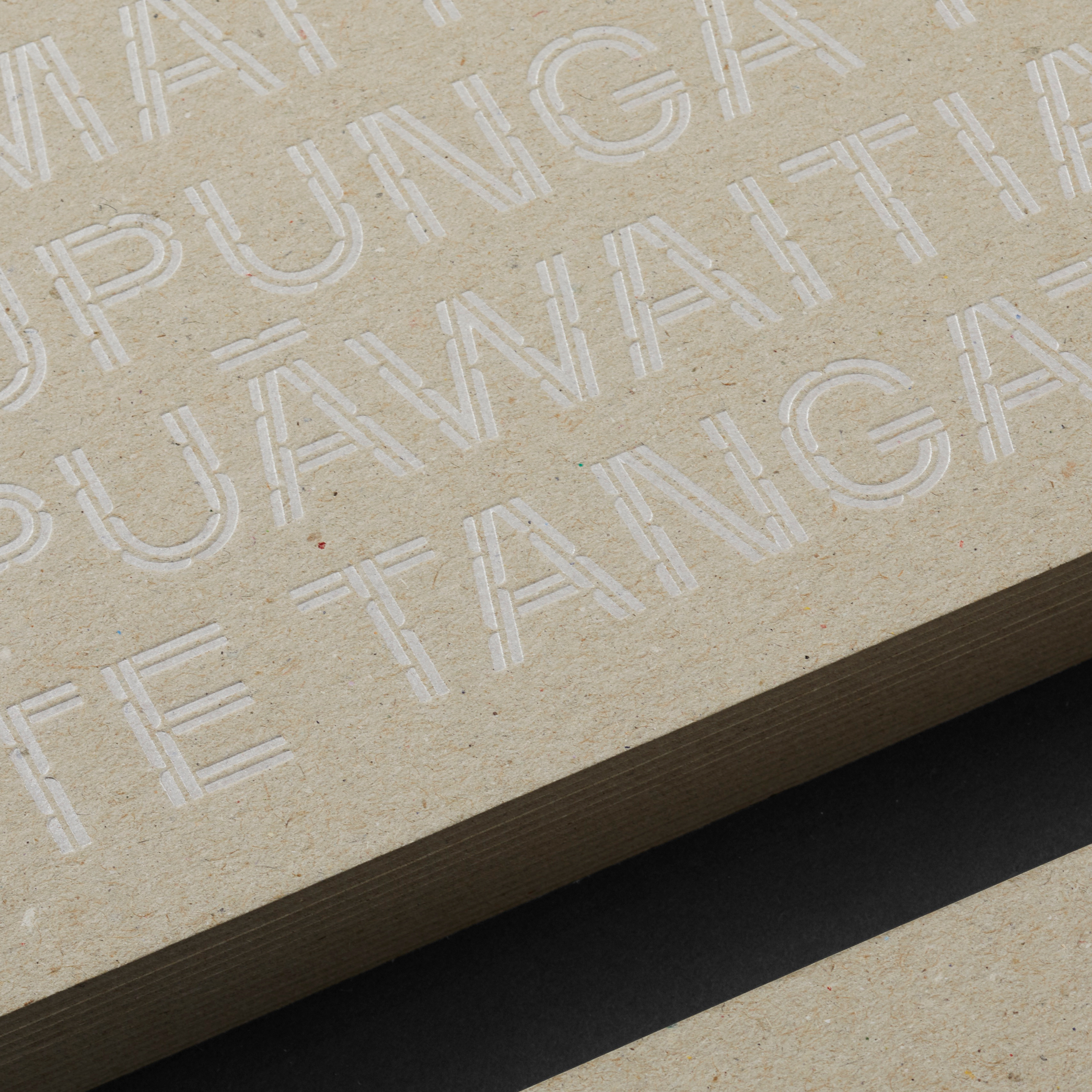
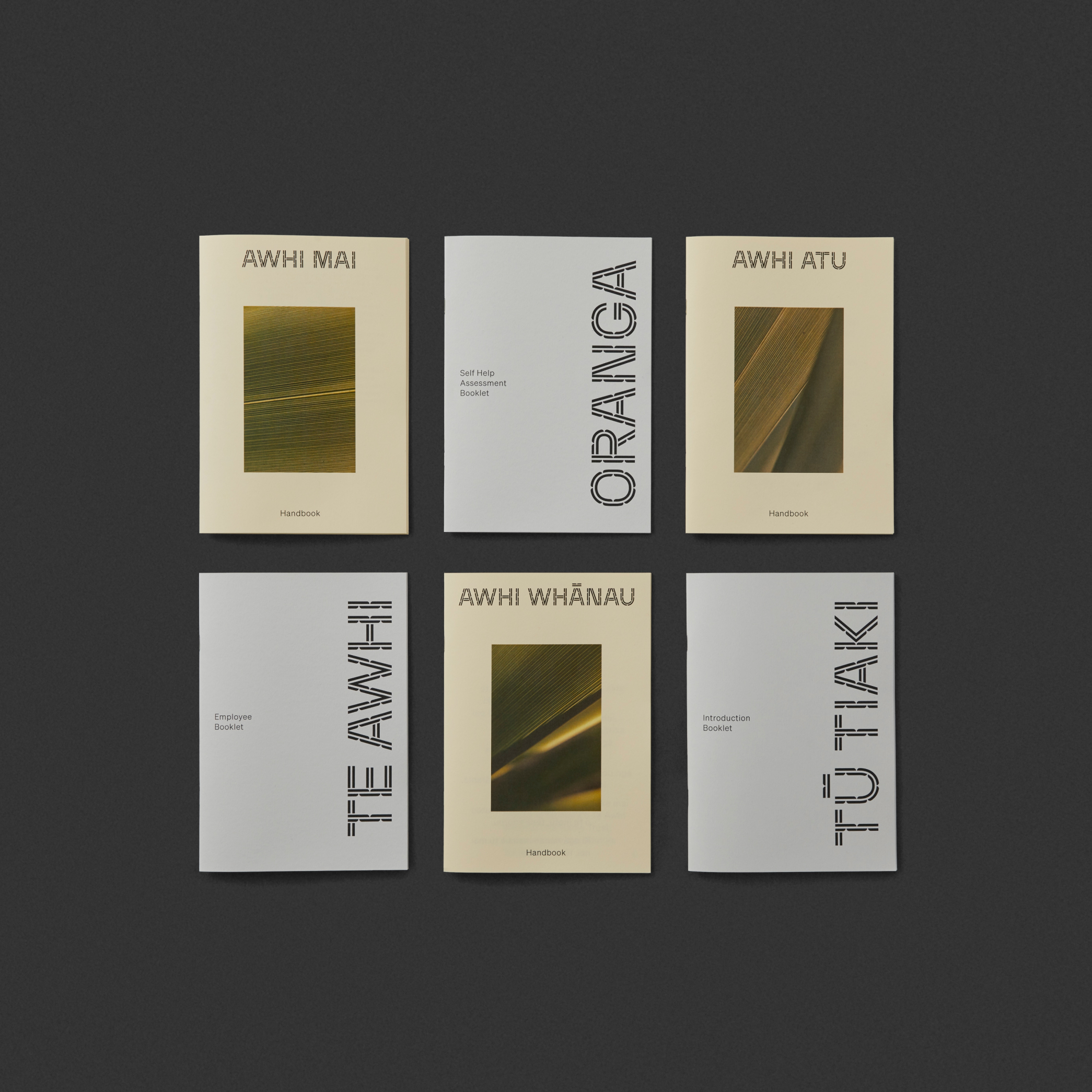
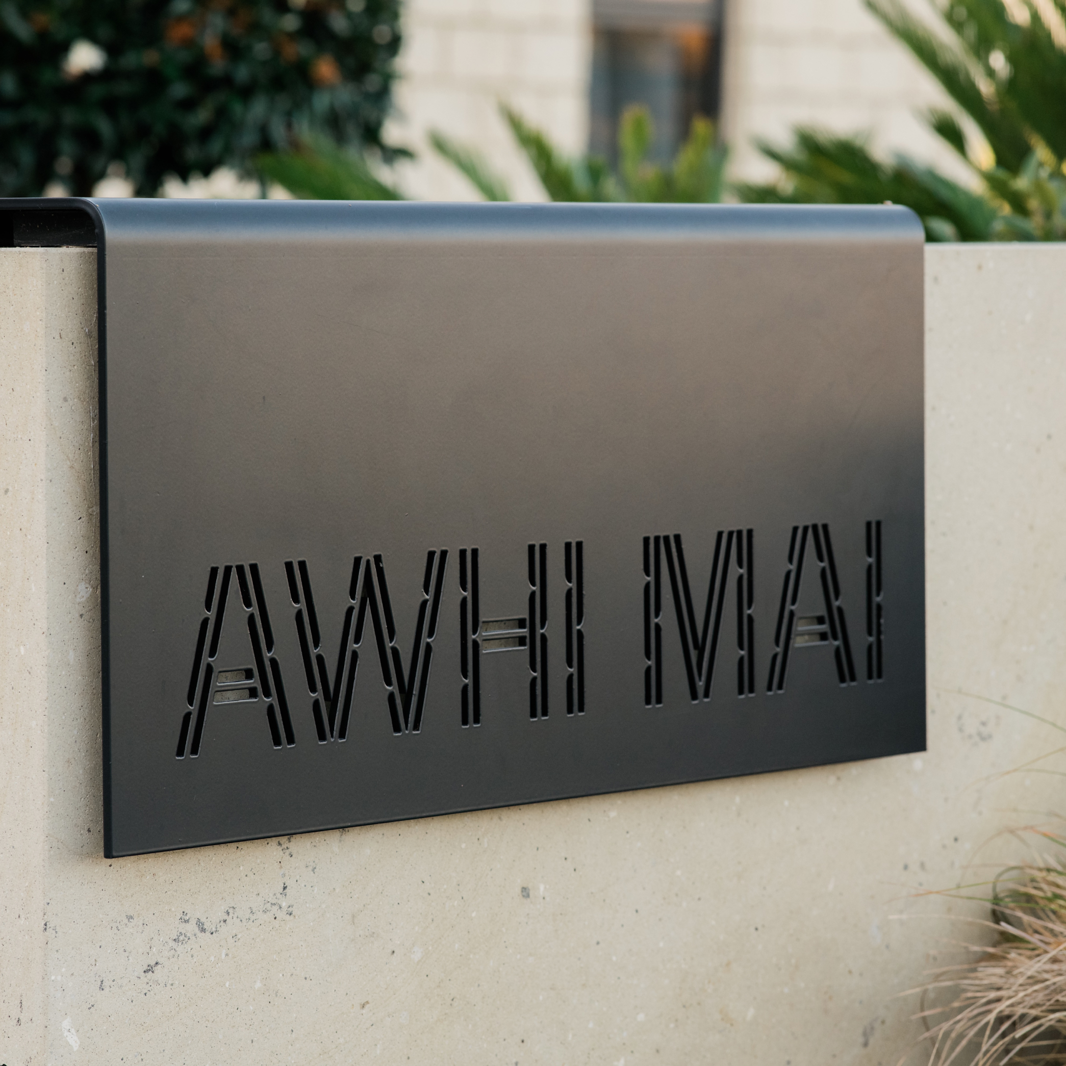
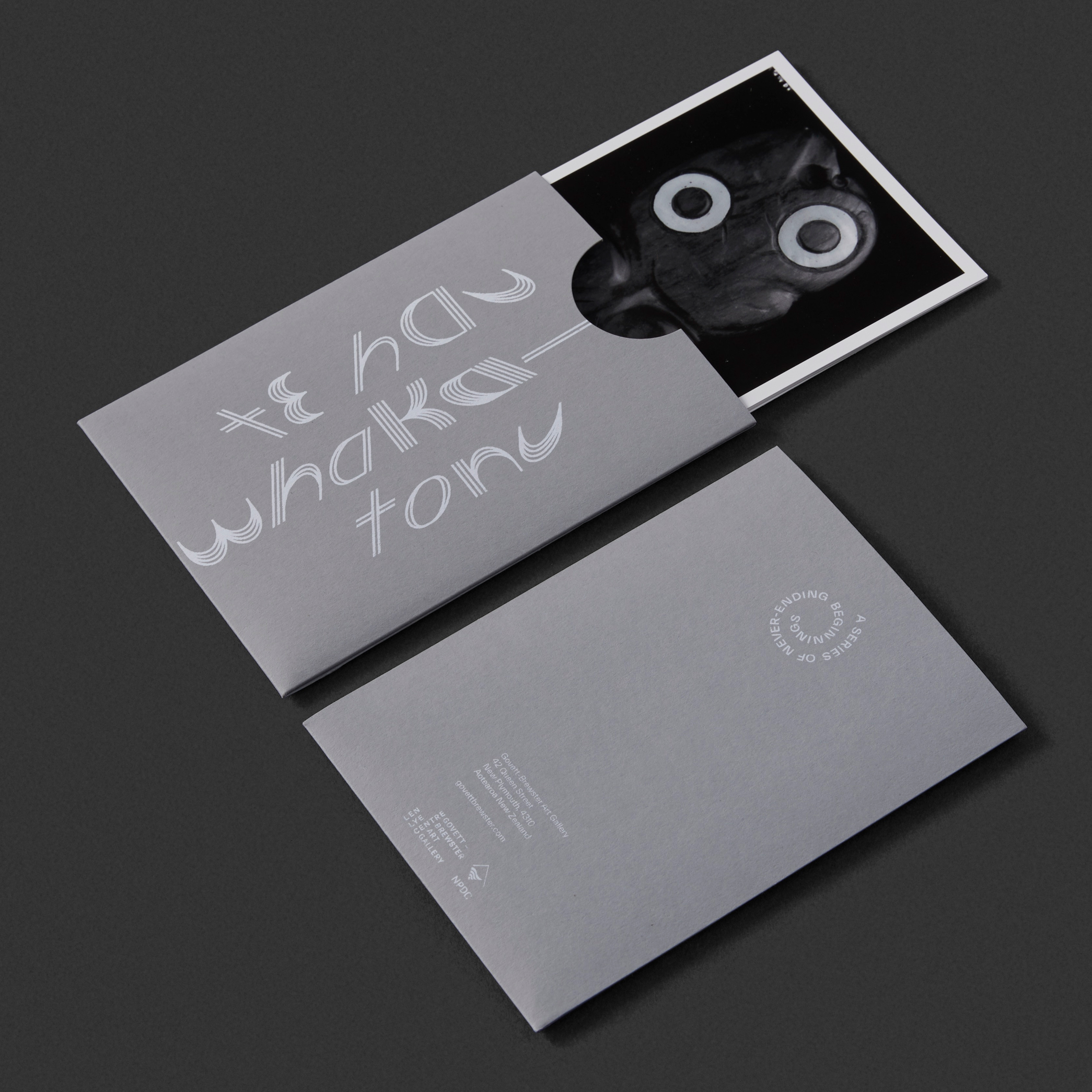
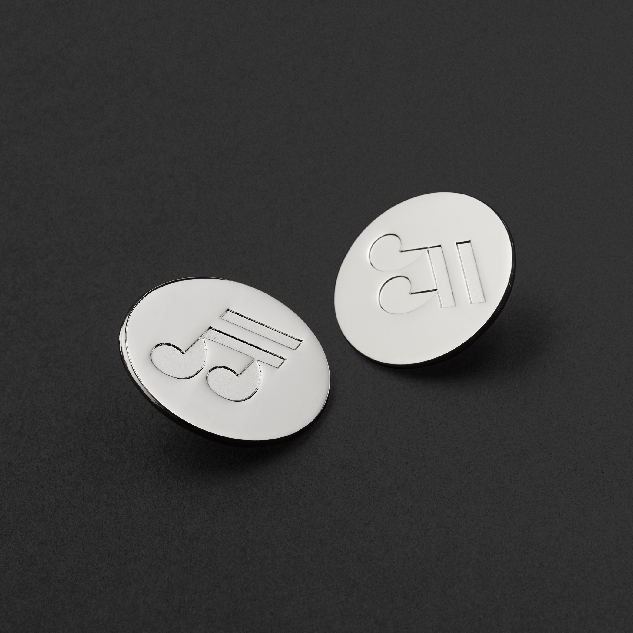
To make the metaphor more visually apparent, we created a custom display typeface for Te Awhi inspired by Pā Harakeke. This typeface formed the heart of the new brand. It is used as the Te Awhi wordmark, and also flows through their services: Awhi Mai, Awhi Atu, Awhi Whānau and Awhi Ora.
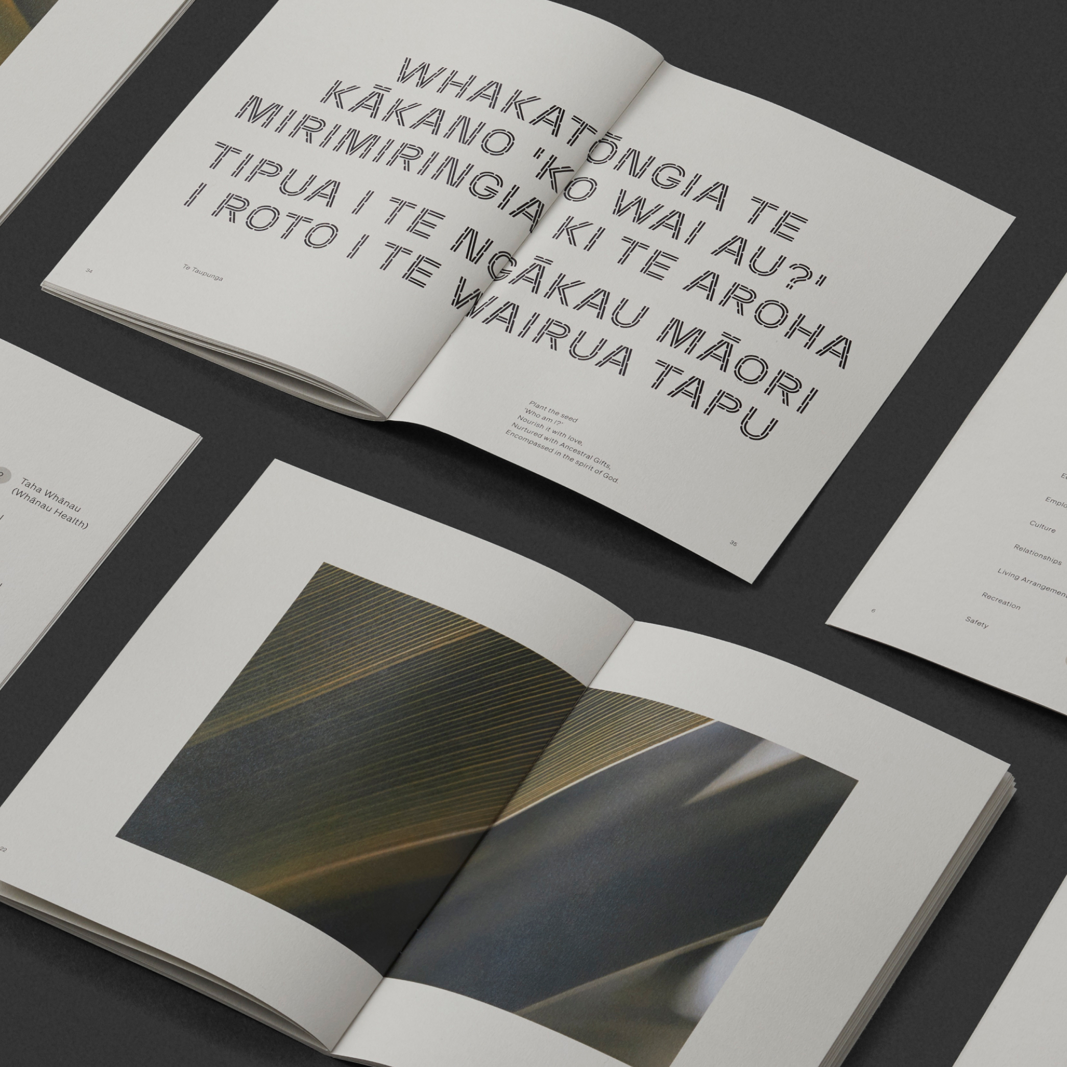
When used in sentences, the typeface itself becomes a blooming Pā Harakeke, and the character of the letterforms plays a critical role in allowing Māori-in-need to proudly see themselves reflected within a health care system that more often than not is alienating and misaligned culturally.
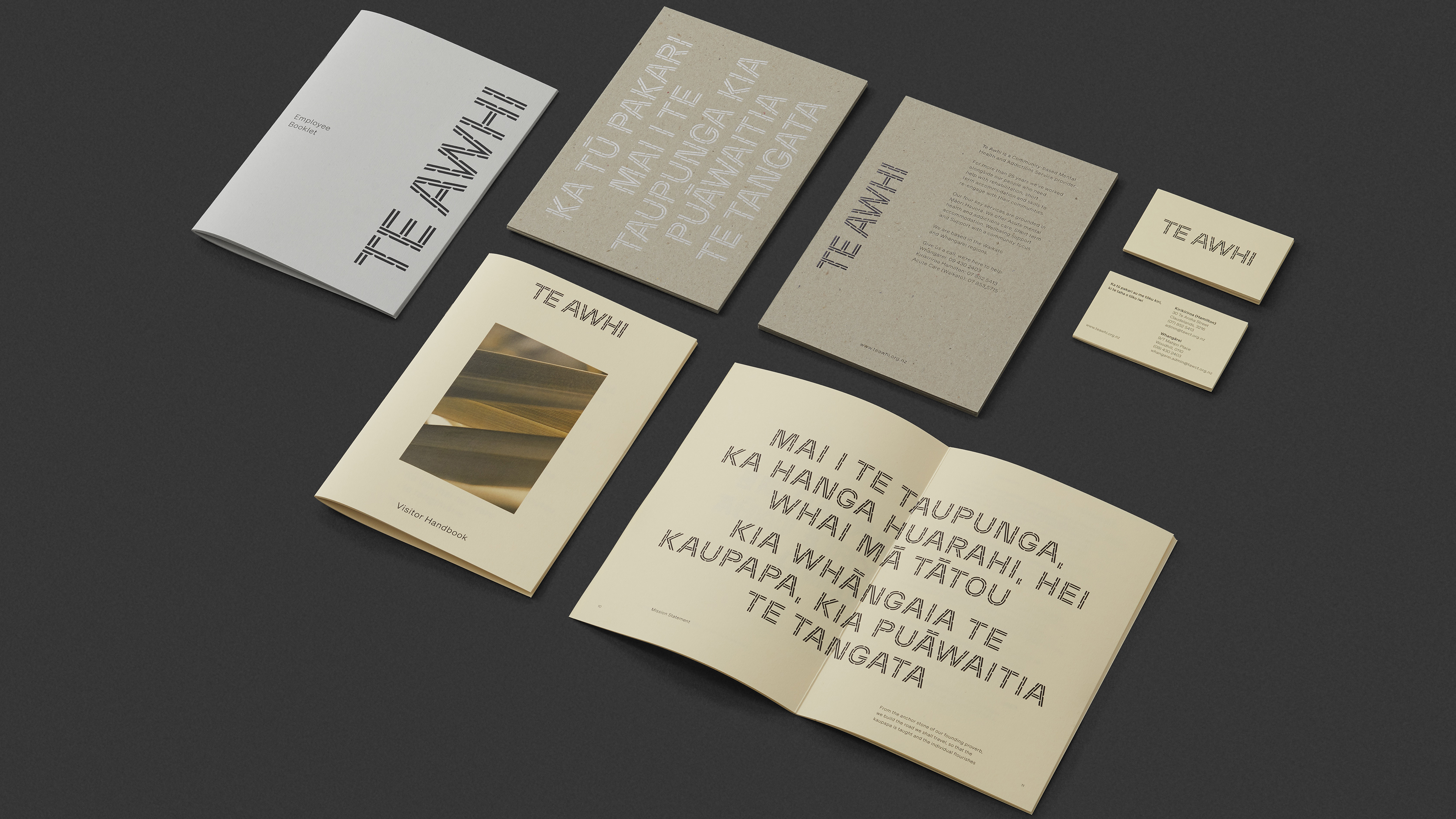
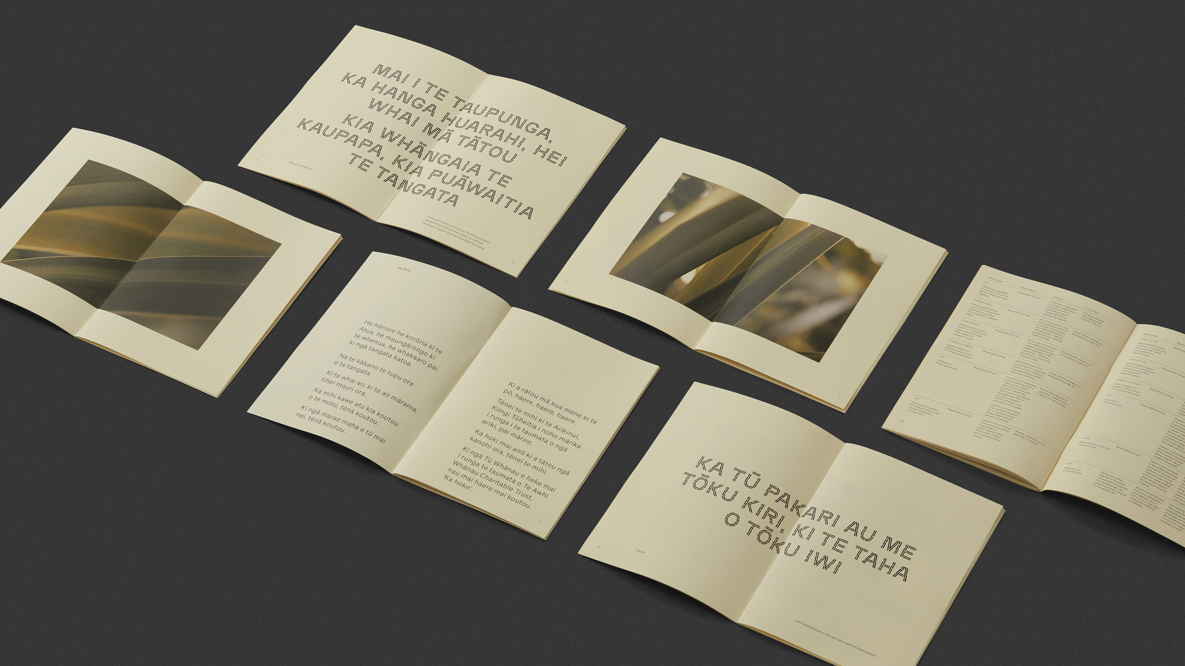
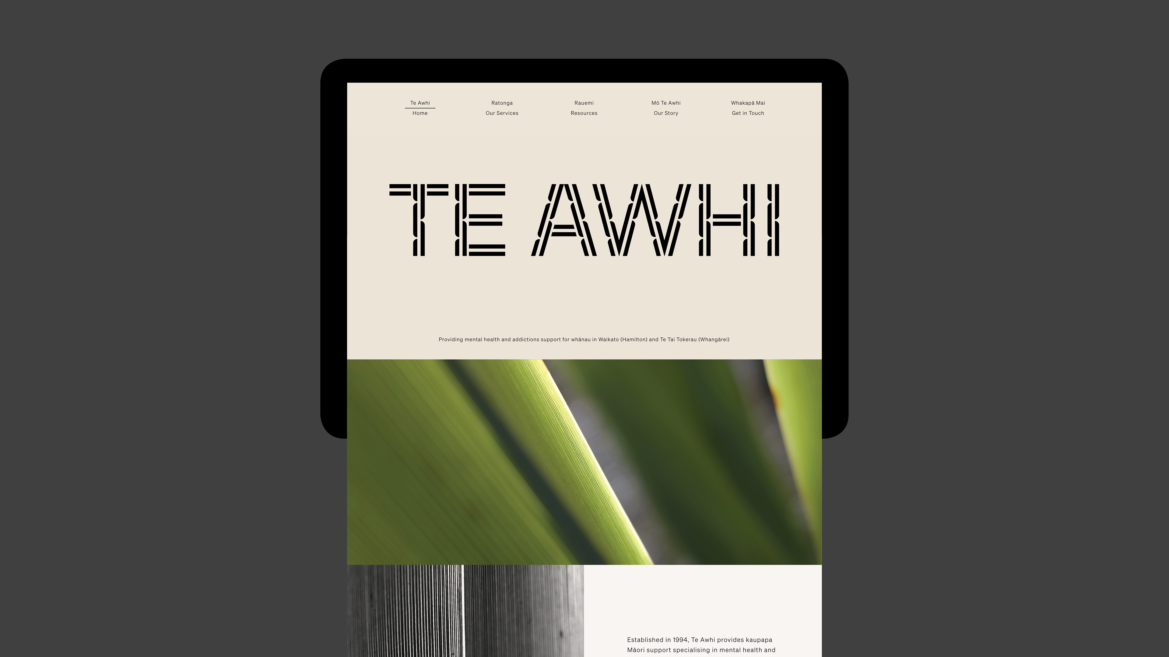
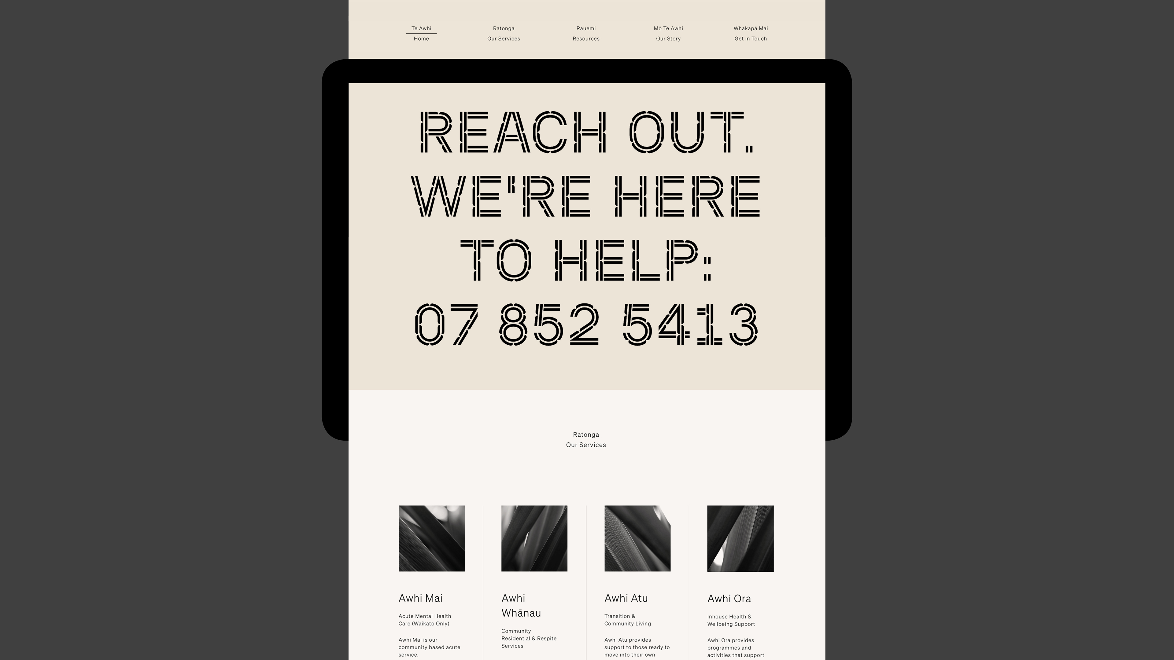
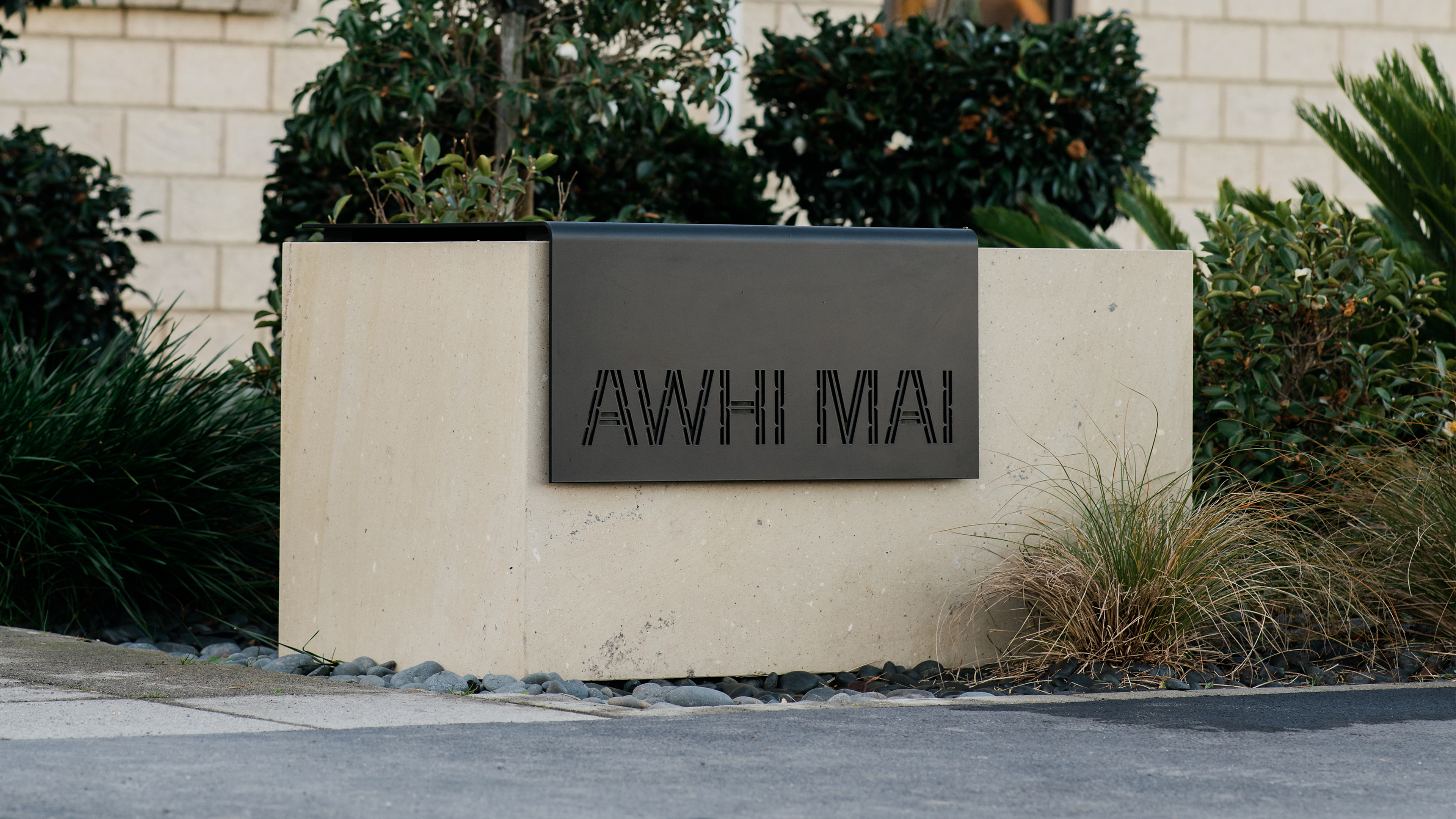
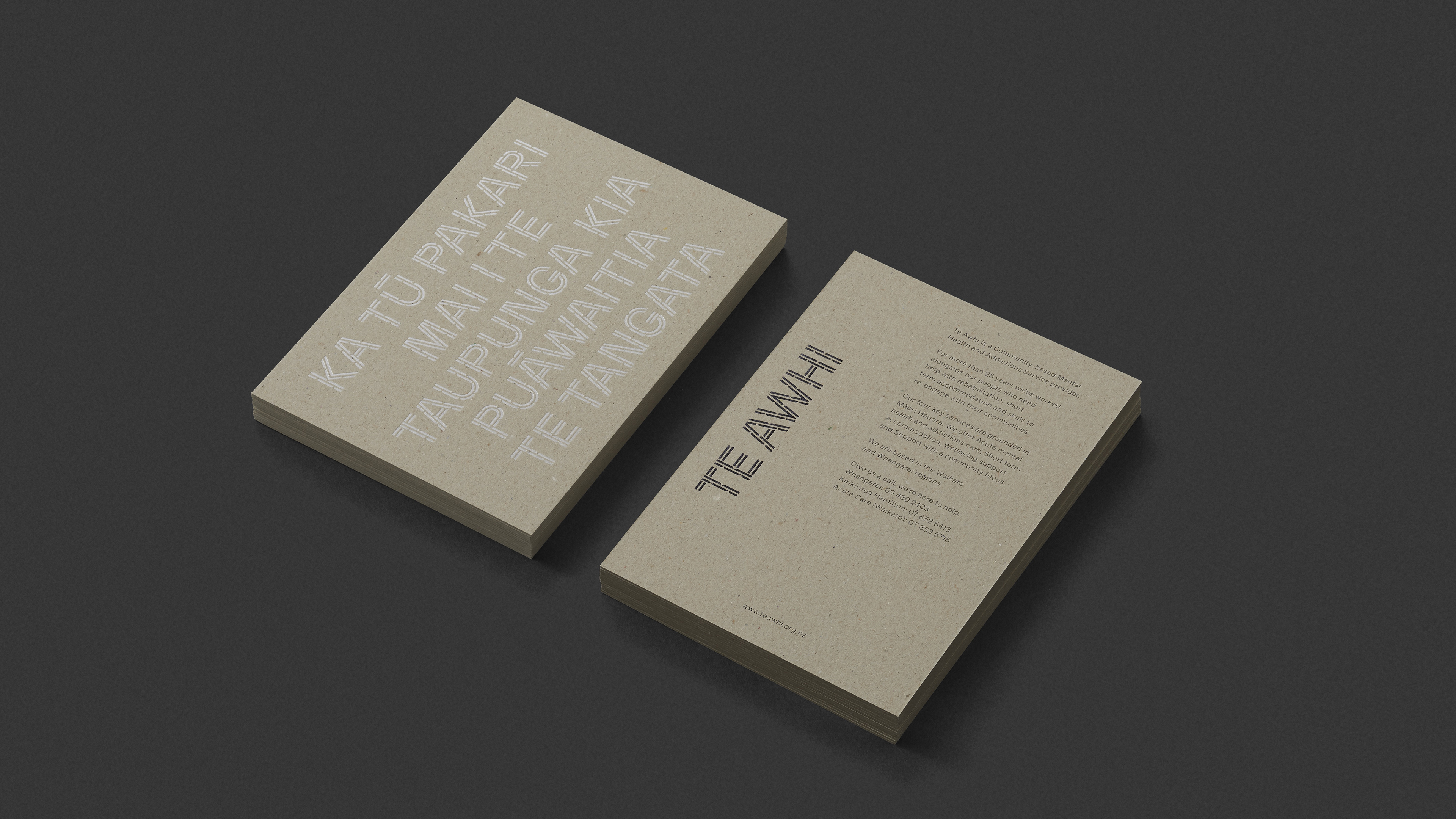
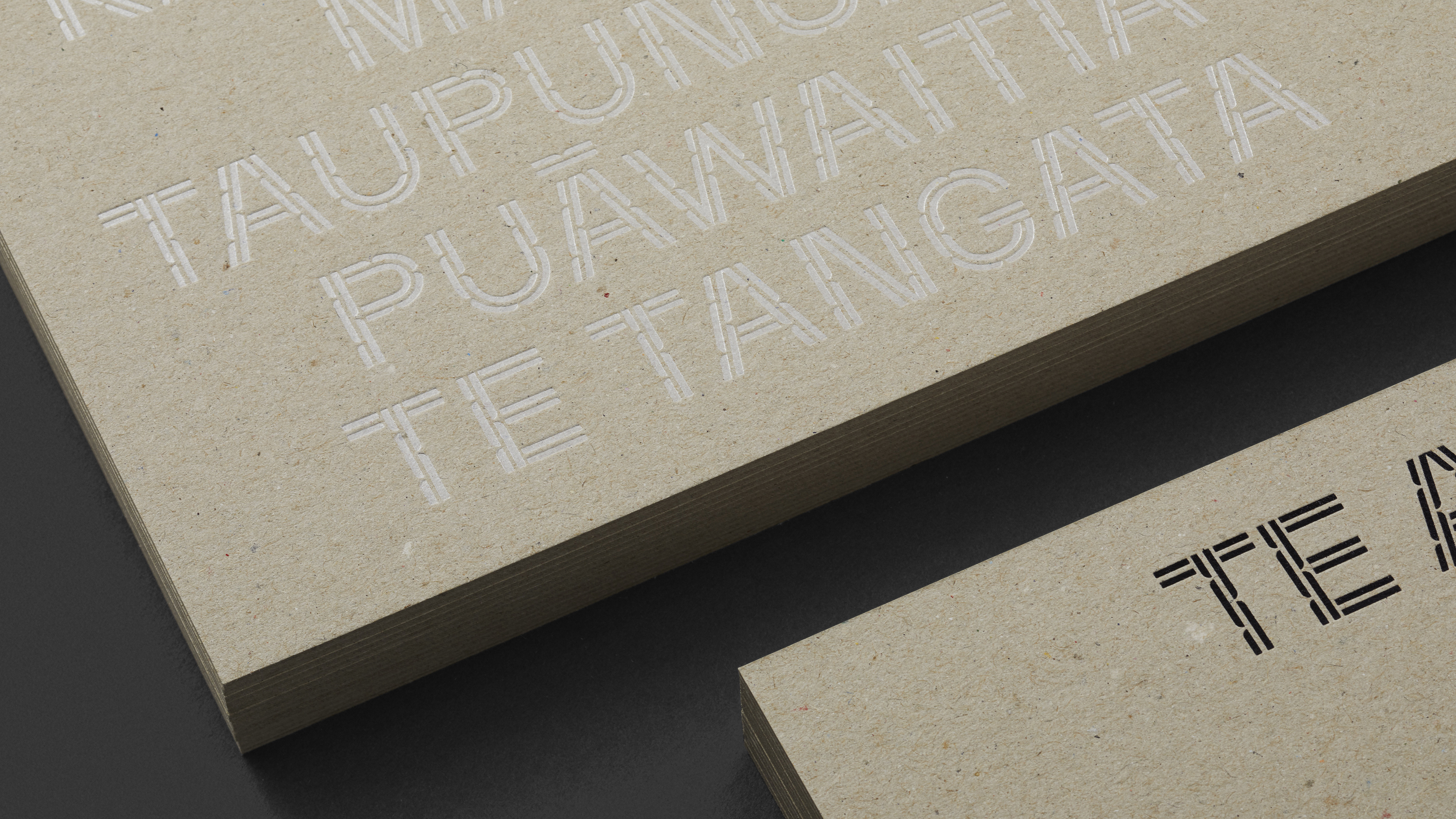
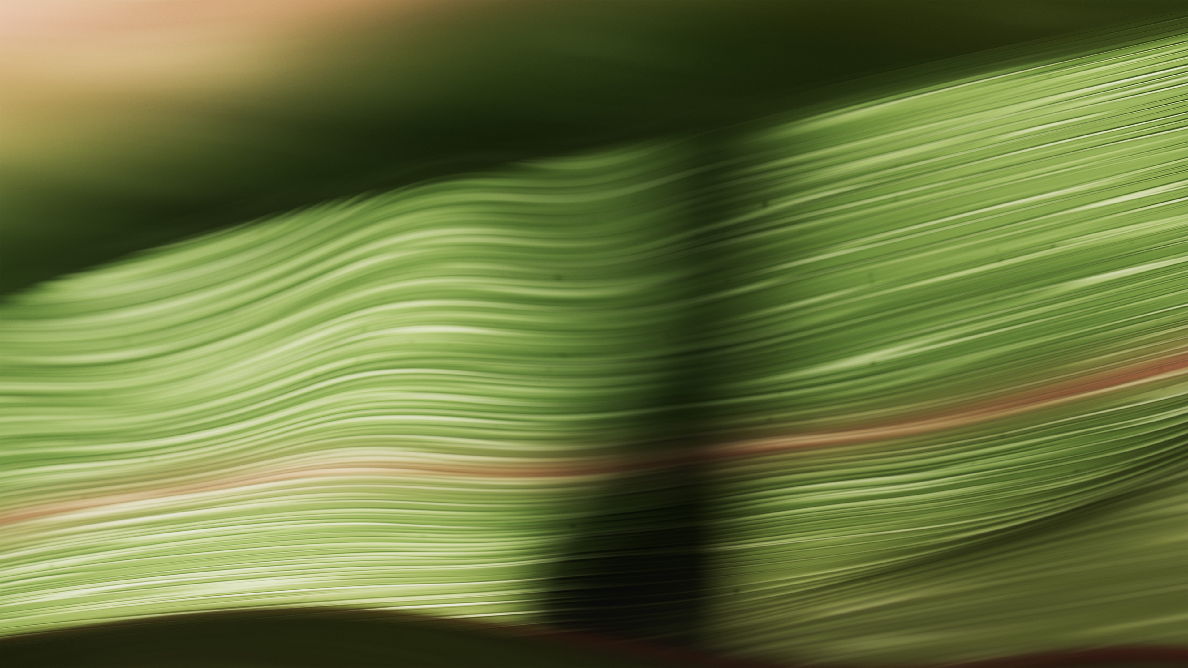
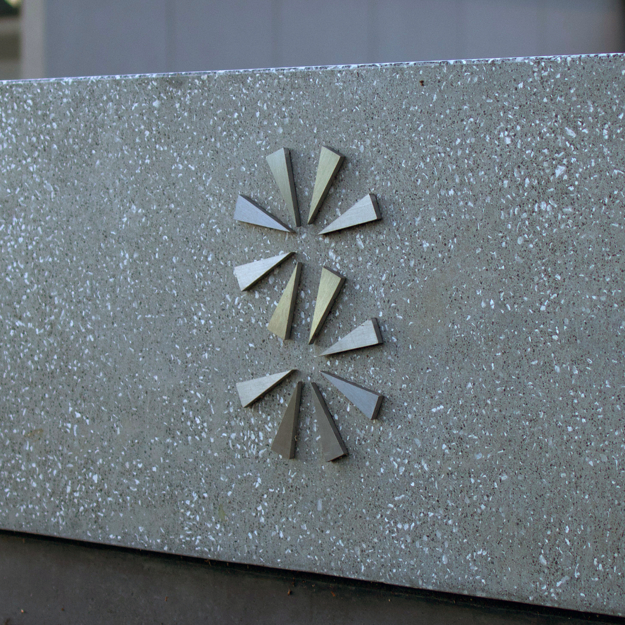
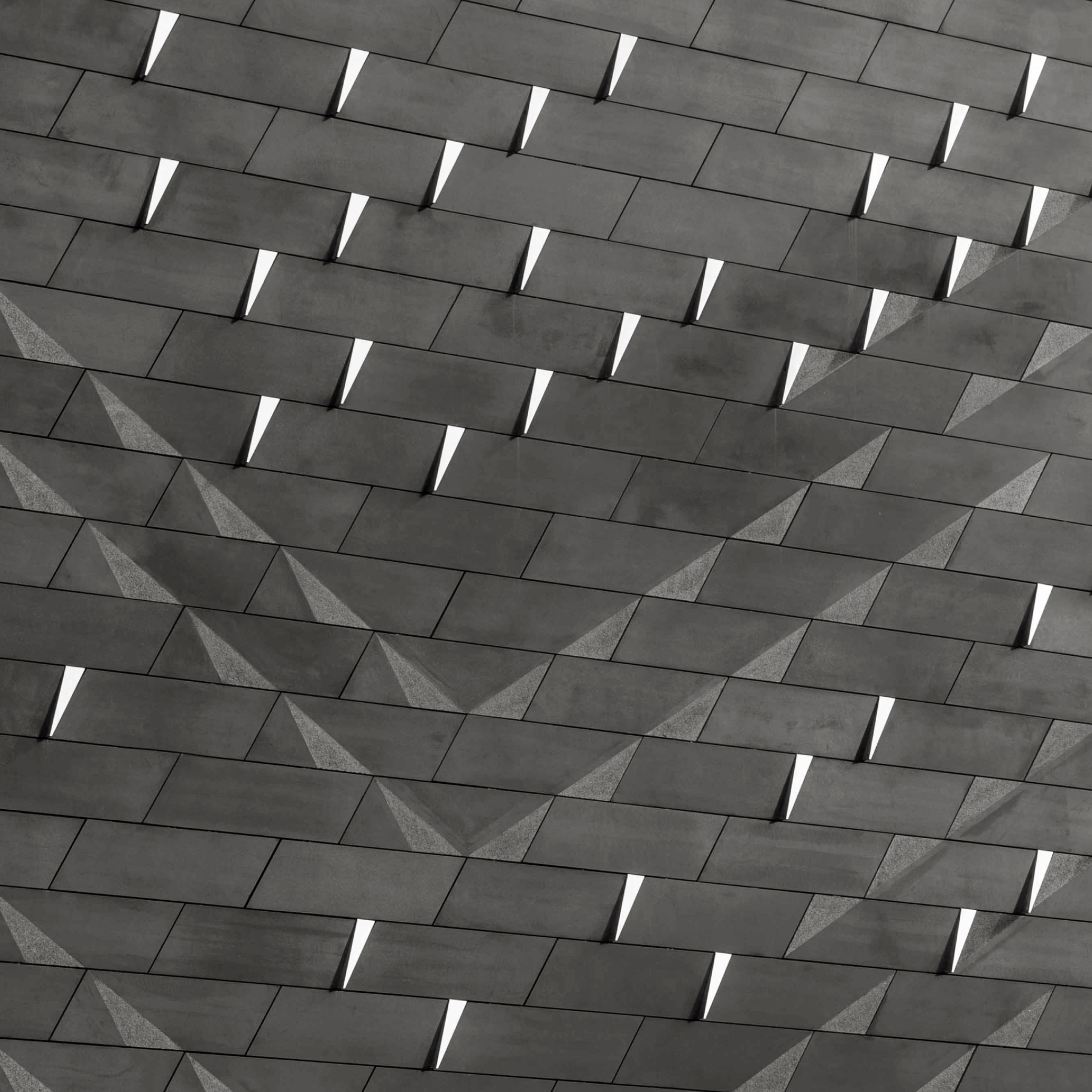
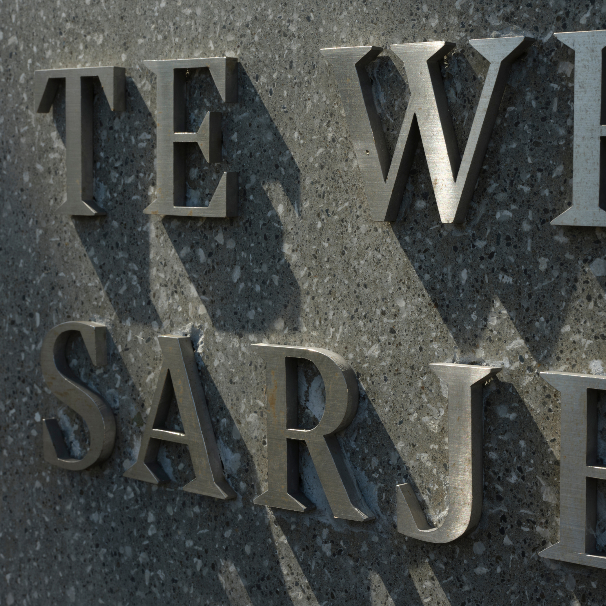
To further heighten the connection to nature, photos of harakeke are used throughout. The colour and paper stock palettes of creams and earthy greys create a tactile warmth, and physical signage pairs locally sourced hinuera volcanic stone with aluminium that carries the Te Awhi typeface.
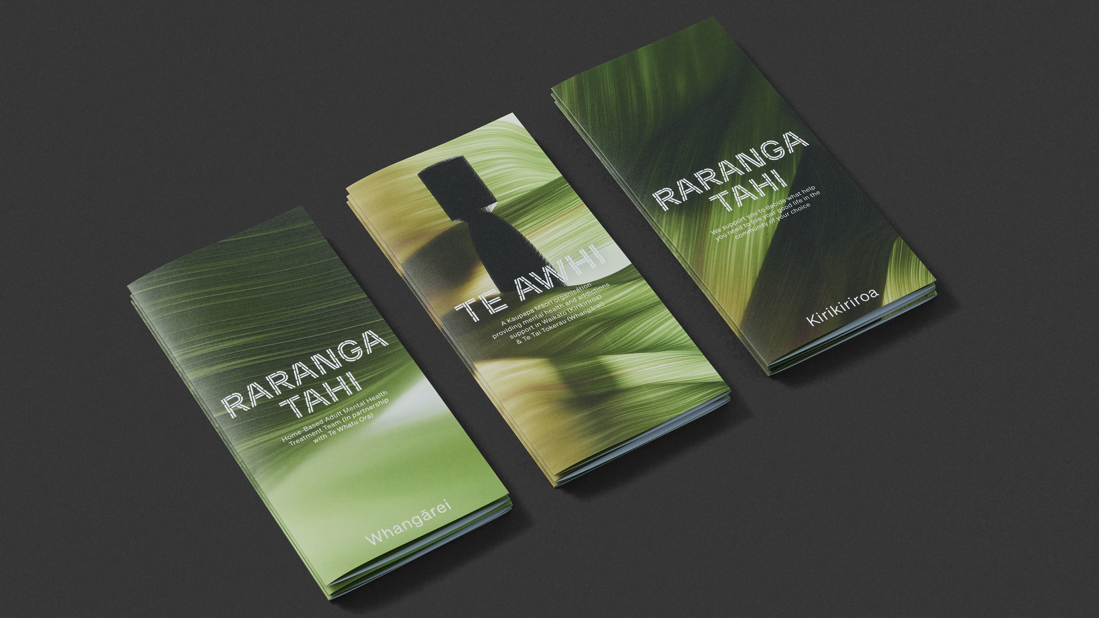
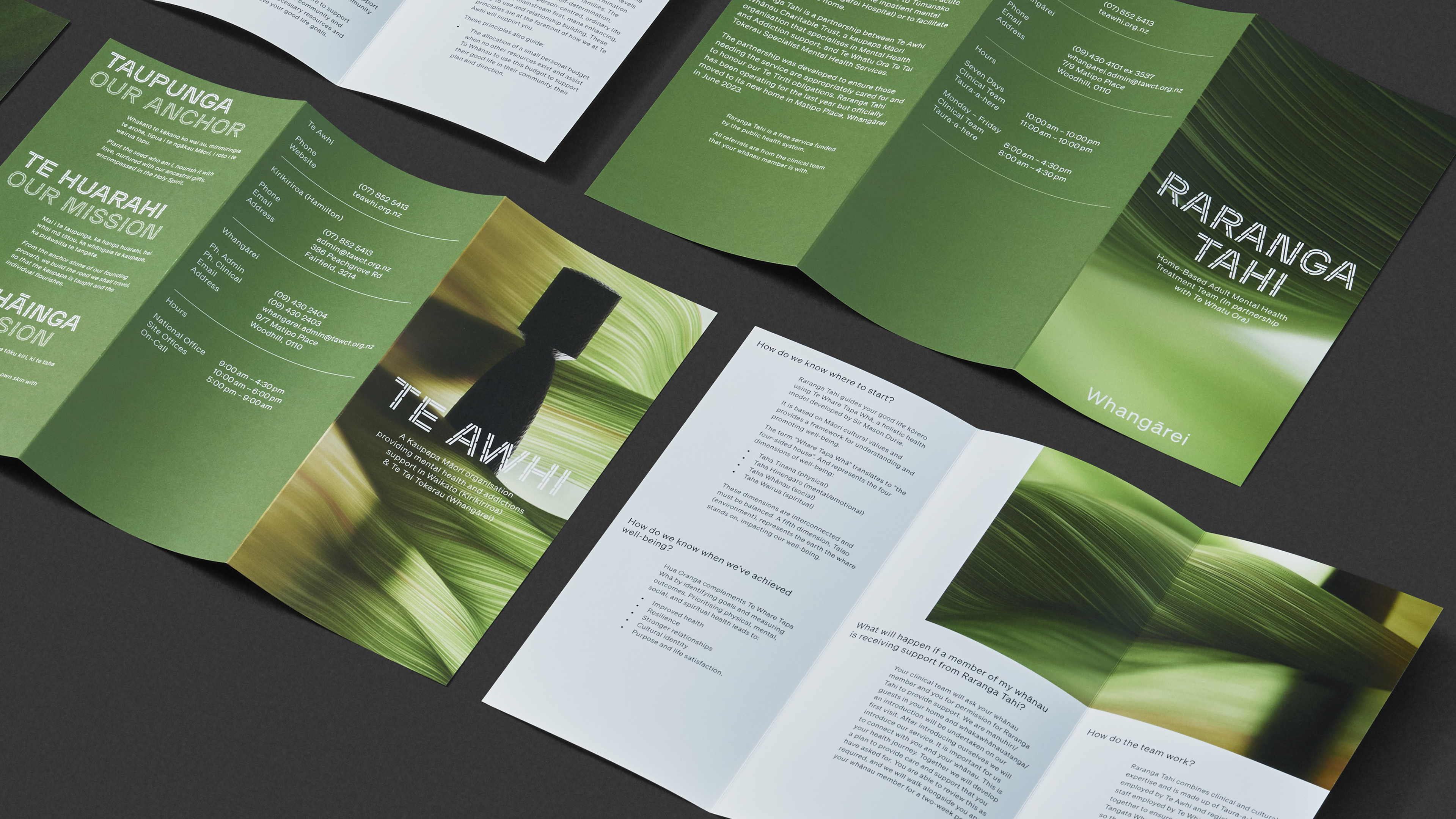
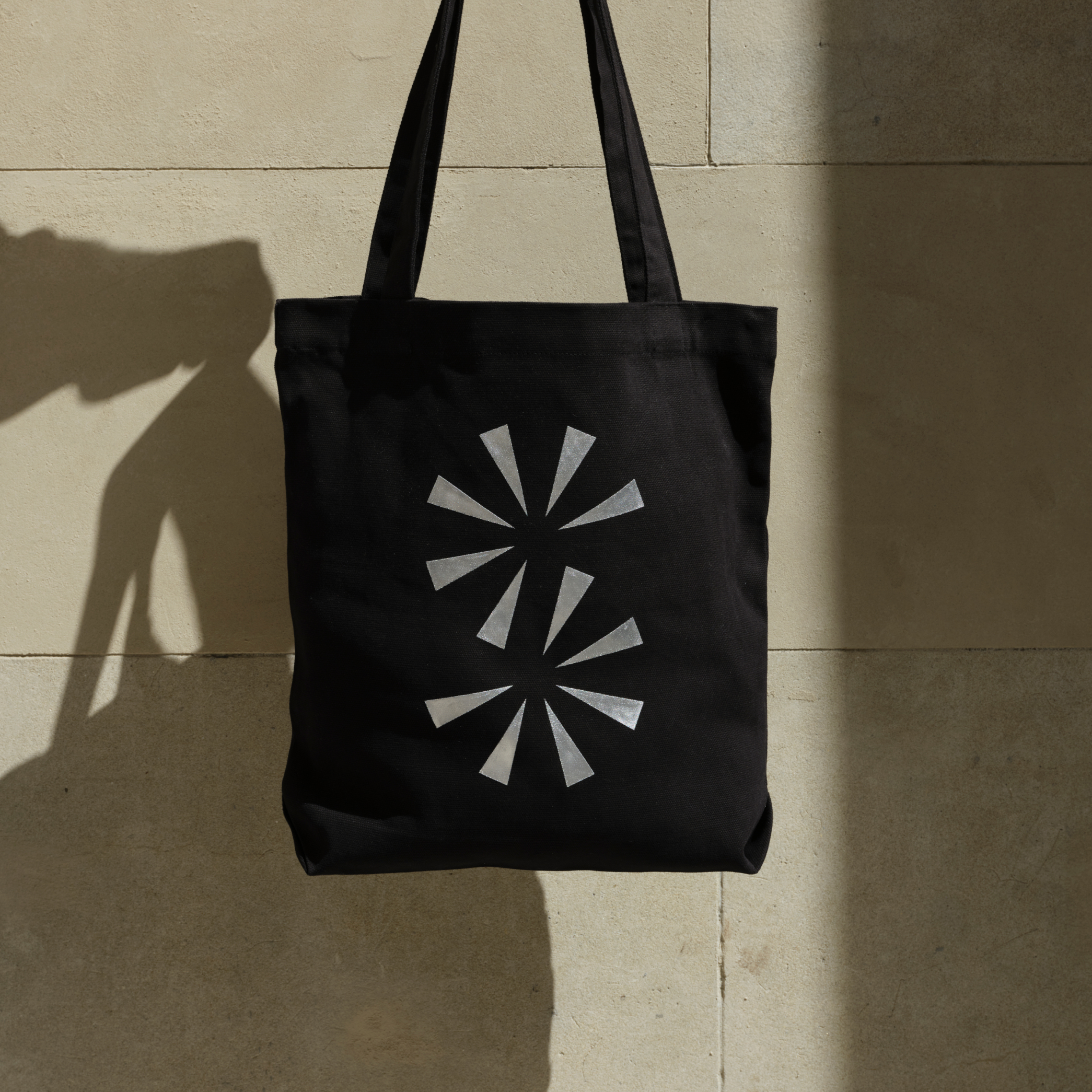
The identity was rolled out across all print pieces, the website, staff uniforms and physical site signage.
The result is a natural, welcoming experience that stands in complete contrast to the stark, clinical world of public healthcare.
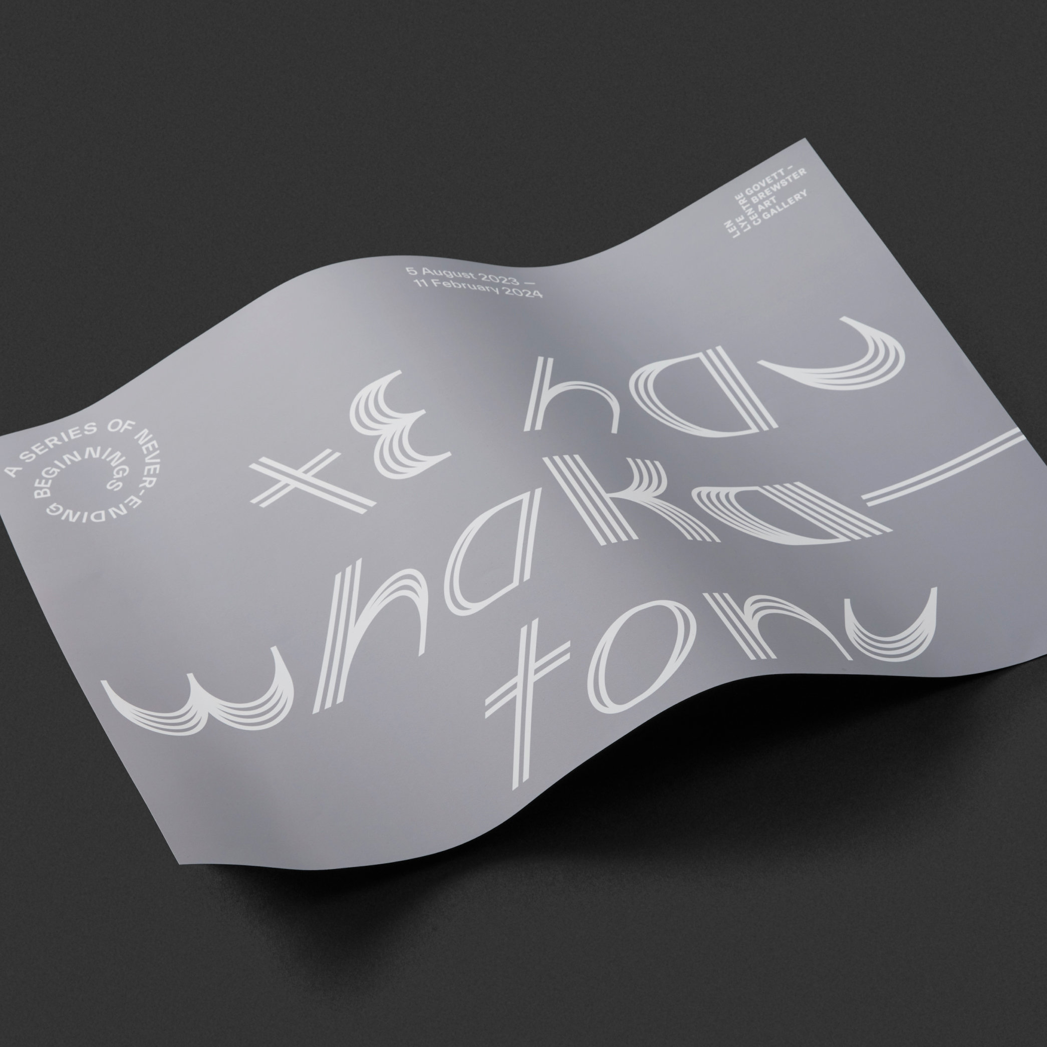
After creating the brand, ee were asked to develop a package of items for their stand at the Indigenous Wellbeing Conference 2024. The purpose was to expand on the existing brand storytelling by expressing the valuable work they do, with an emphasis on approaching health from a te Ao Māori standpoint.
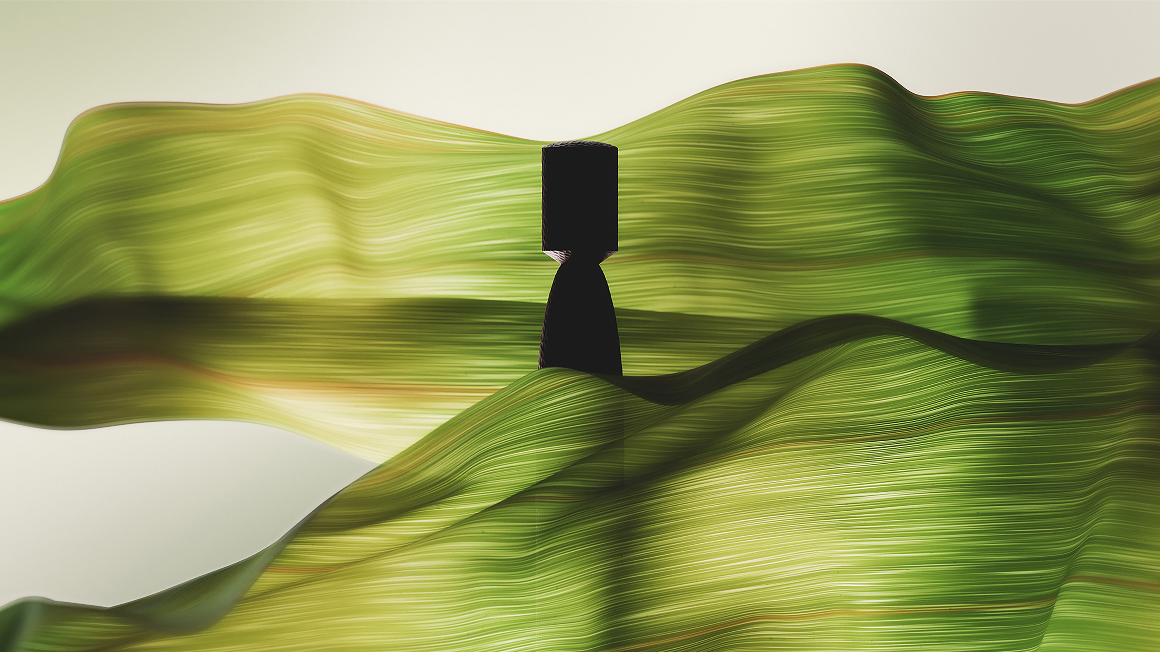
At the core of Te Awhi's philosophy is the pā harakeke (flax grove) metaphor. Representing the layers of support that wrap around us as Māori to nurture our growth and allow us to stand strong and proud in our own skin.
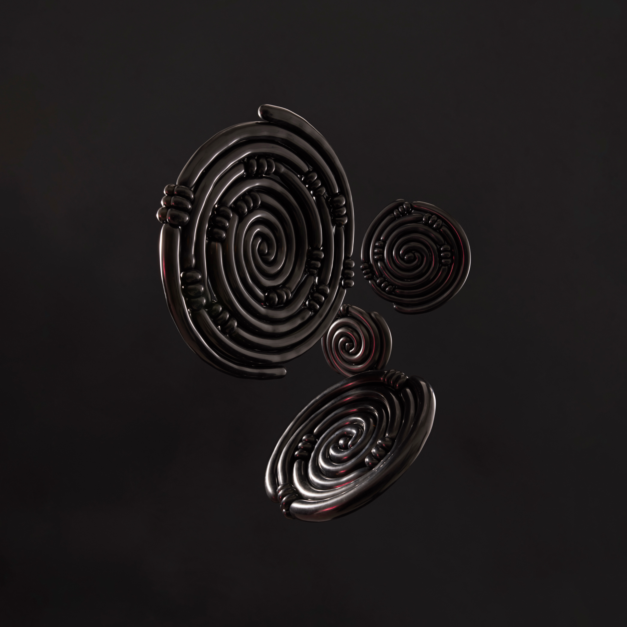
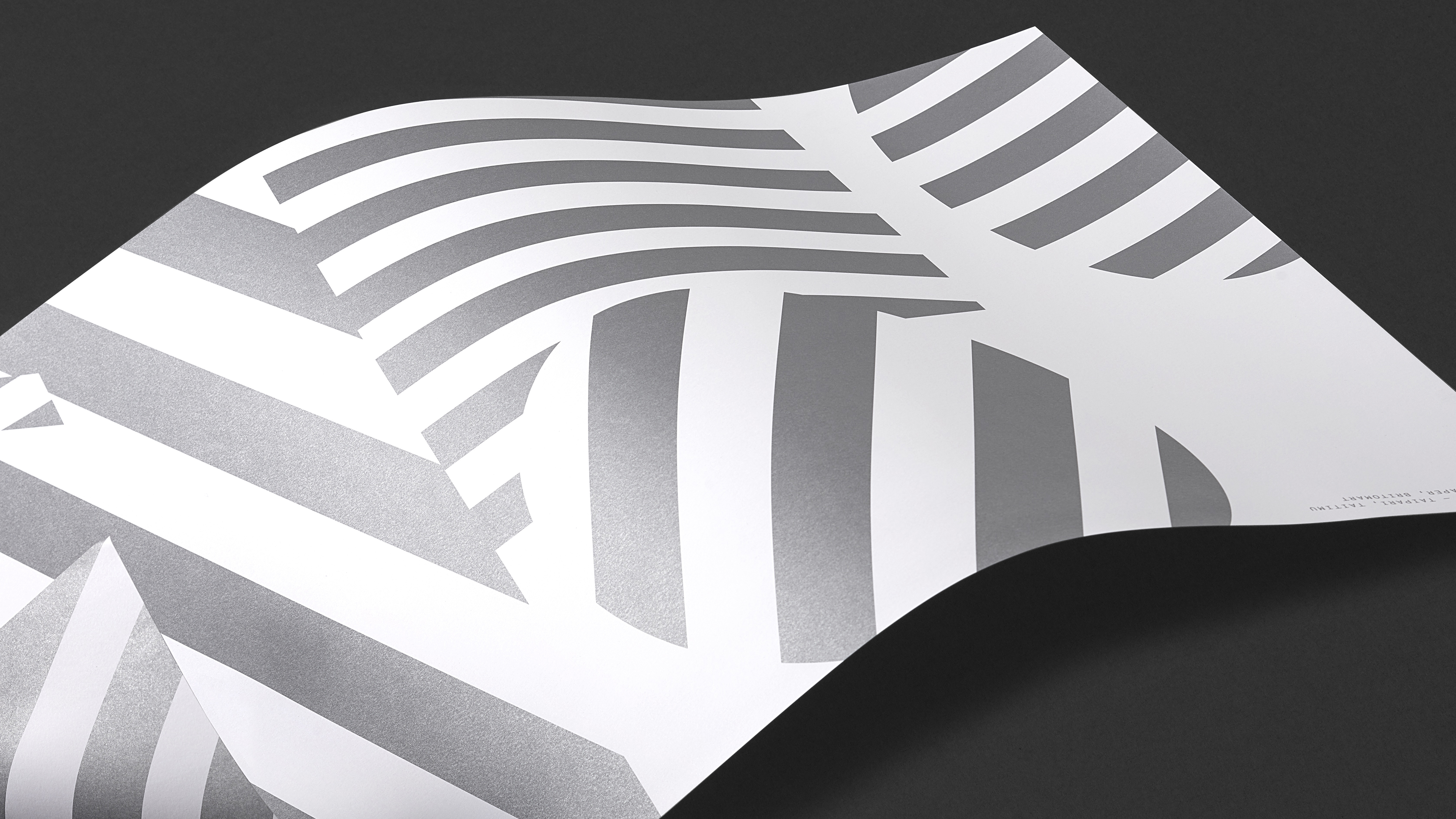
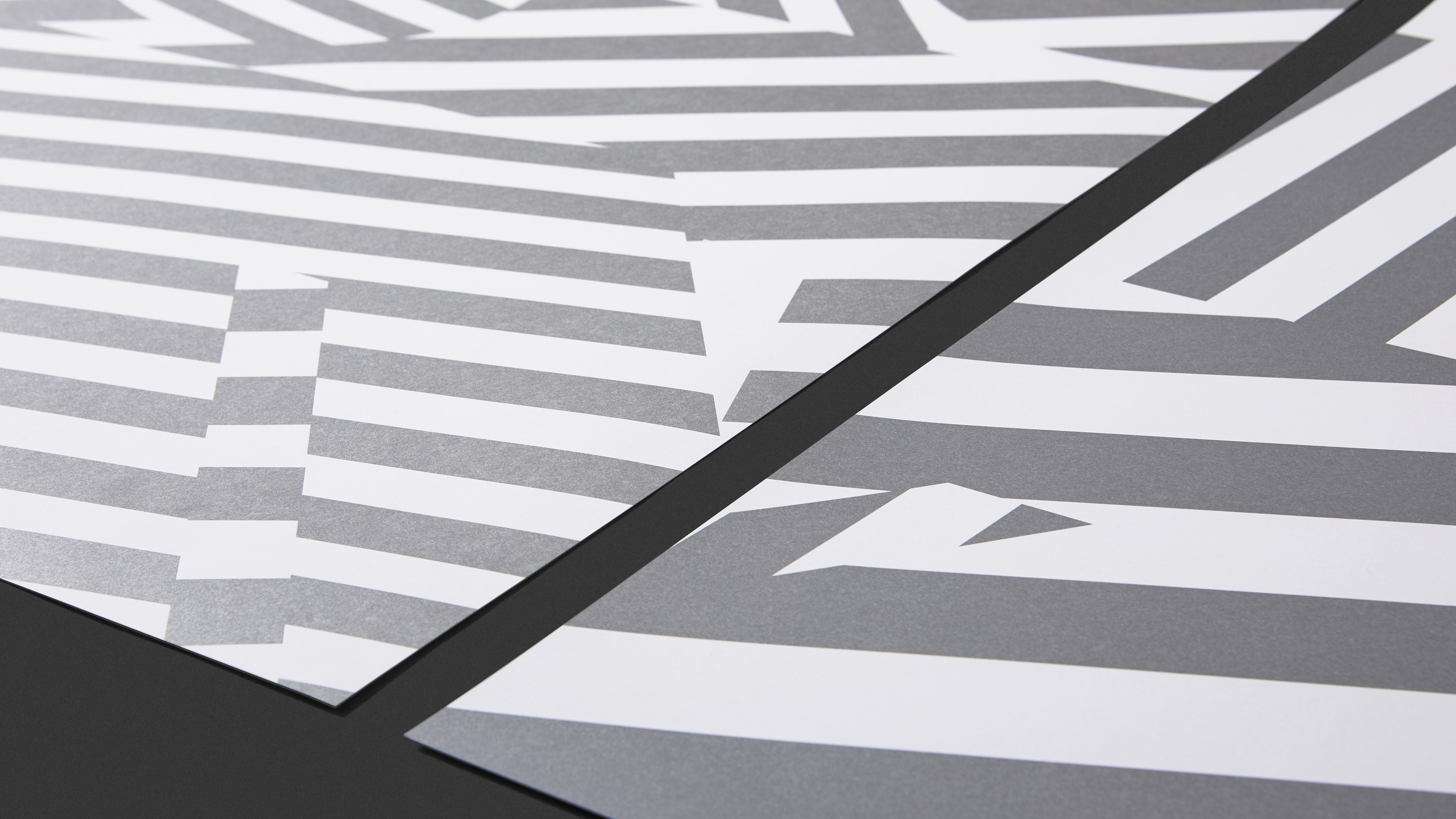
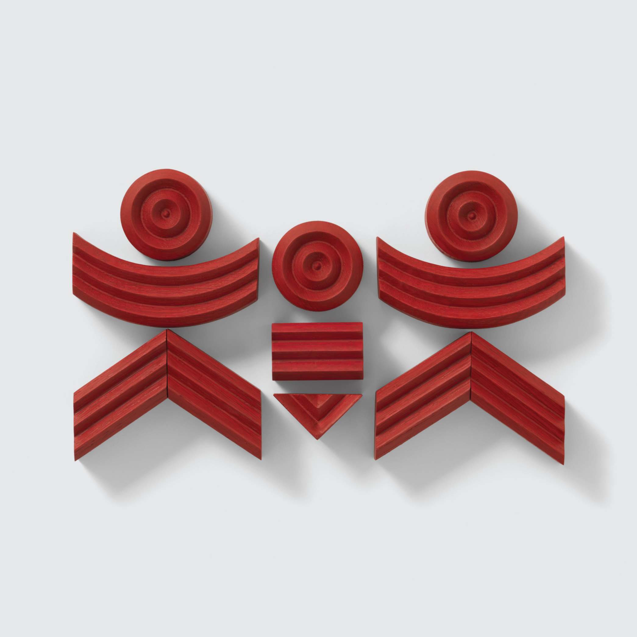
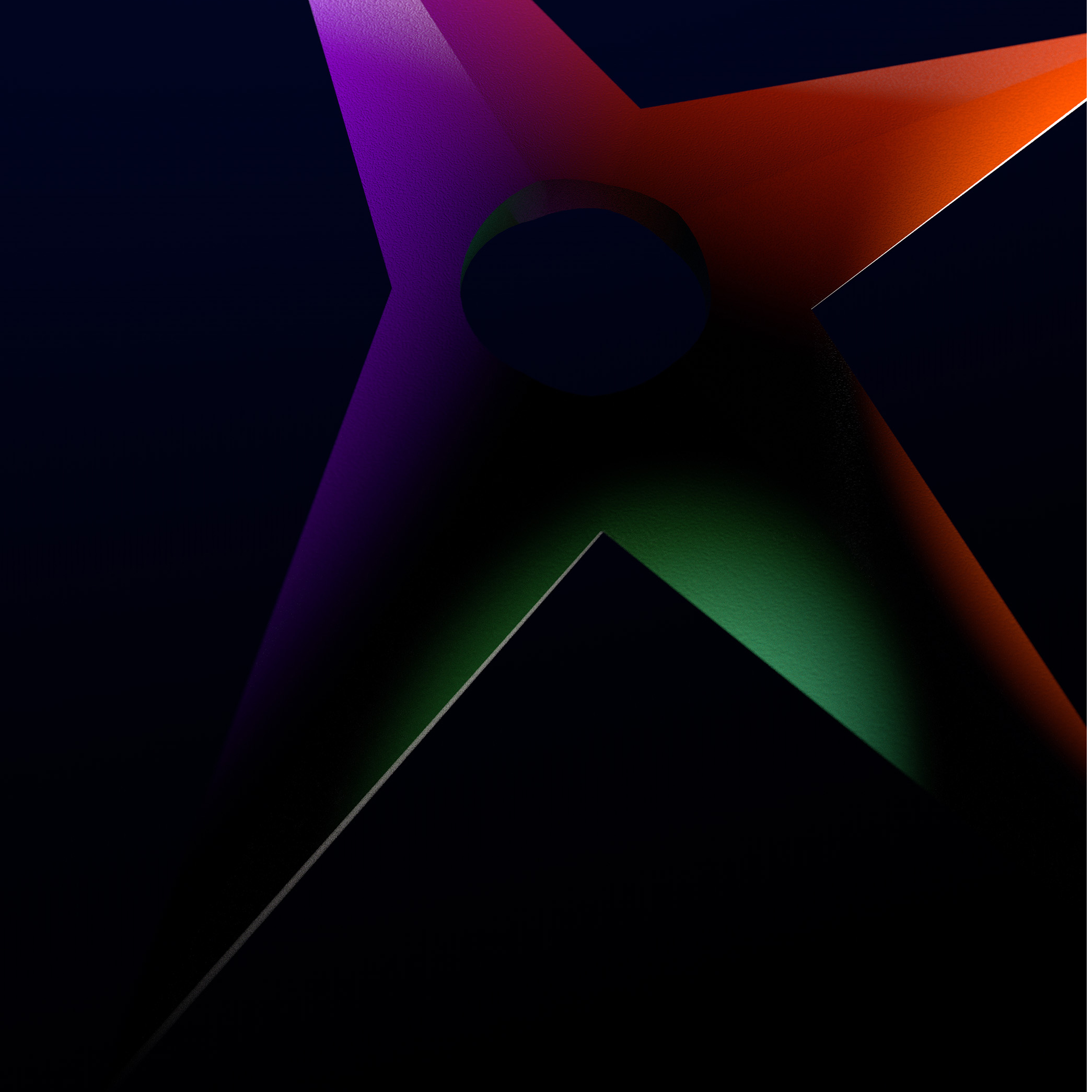
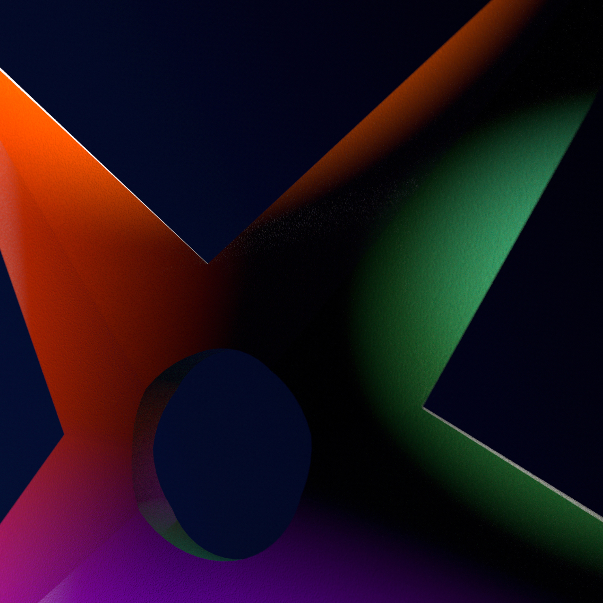
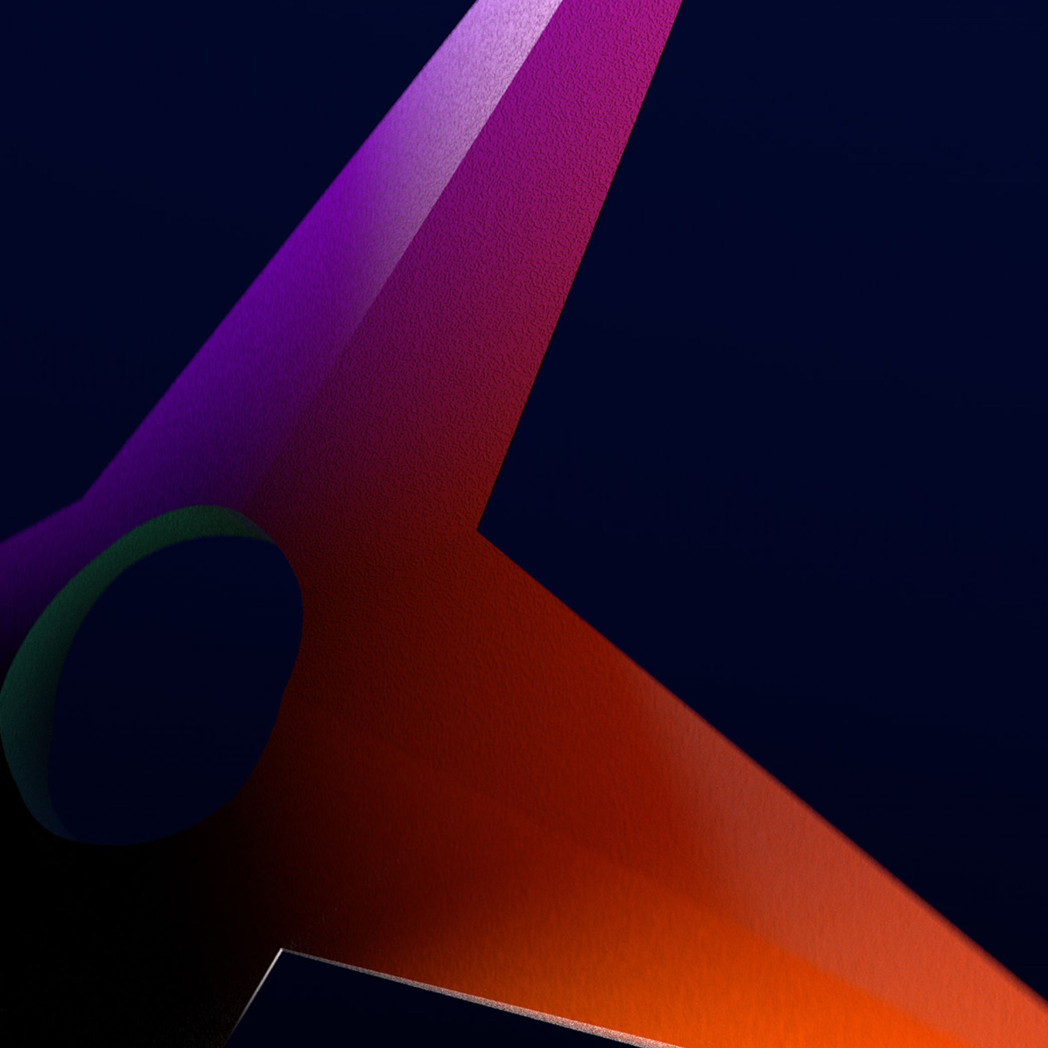
In order to better represent this, we developed a suite of rendered visuals to inspire and communicate this healing from a Māori stand point. In the centre of the visual is a pou, standing tall, as a symbol of humanity. This pou links us to past, present and future generations, and represents te puāwaitanga o te tangata (the flourishing of people). Wrapped around this pou is a cloak inspired by the qualities of pā harakeke, helping to protect and nurture growth and representing the dynamic ups and downs of life. Muka, the worked fibre within harakeke can symbolise the unseen, connecting the physical and the spiritual realms within us.
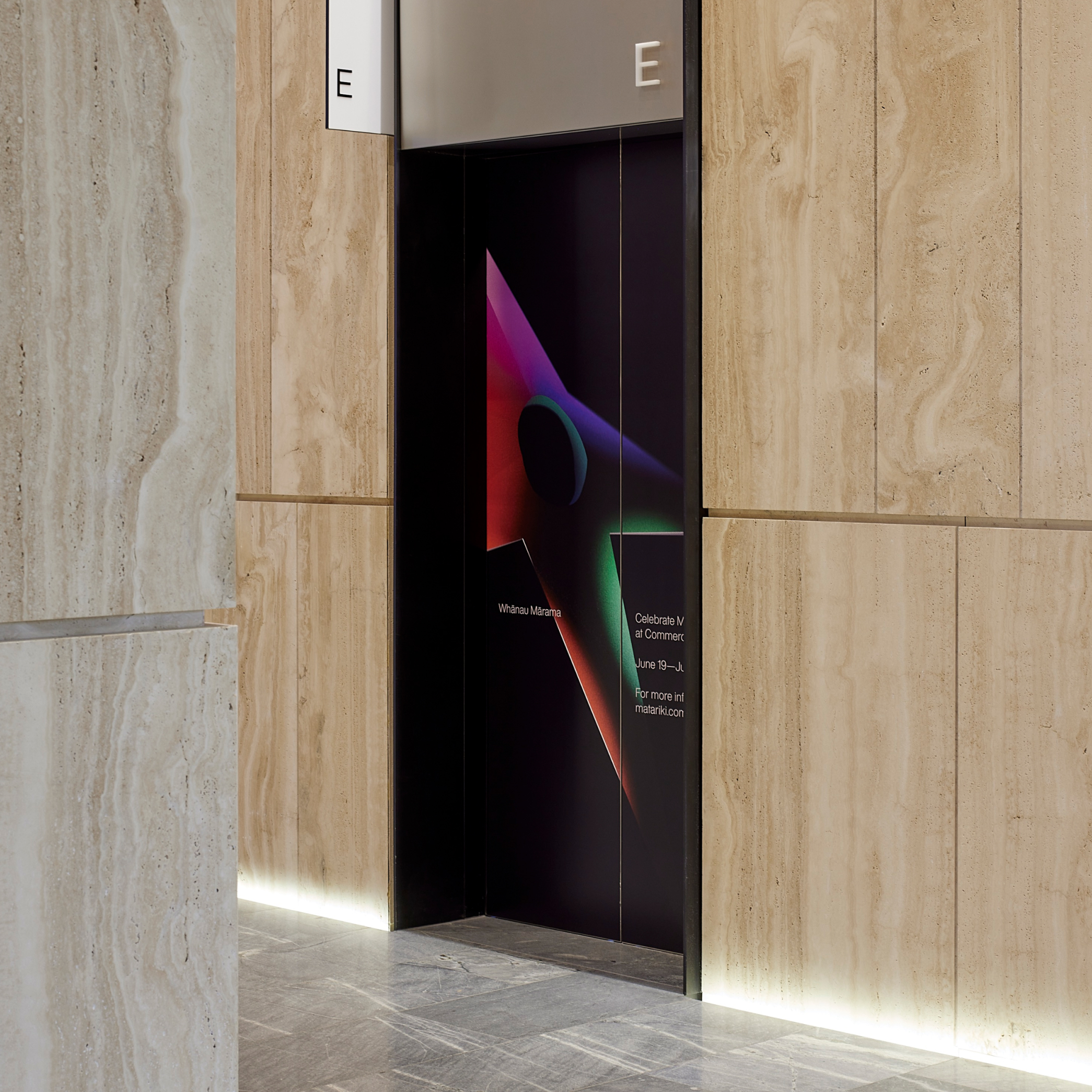
With these ideas in place, the visuals were developed as an additional layer to Te Awhi's communications, bringing colour and dynamism.
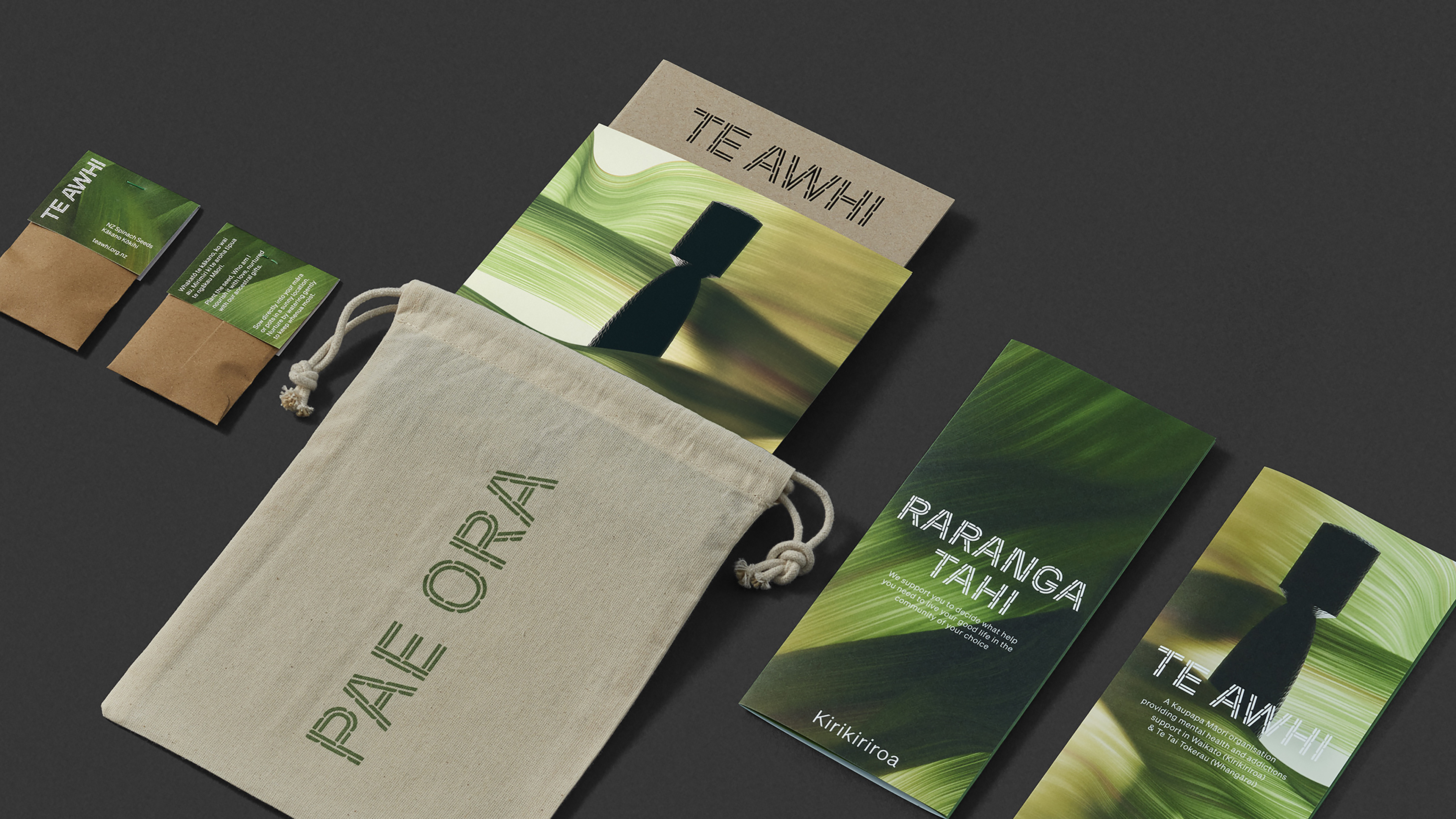
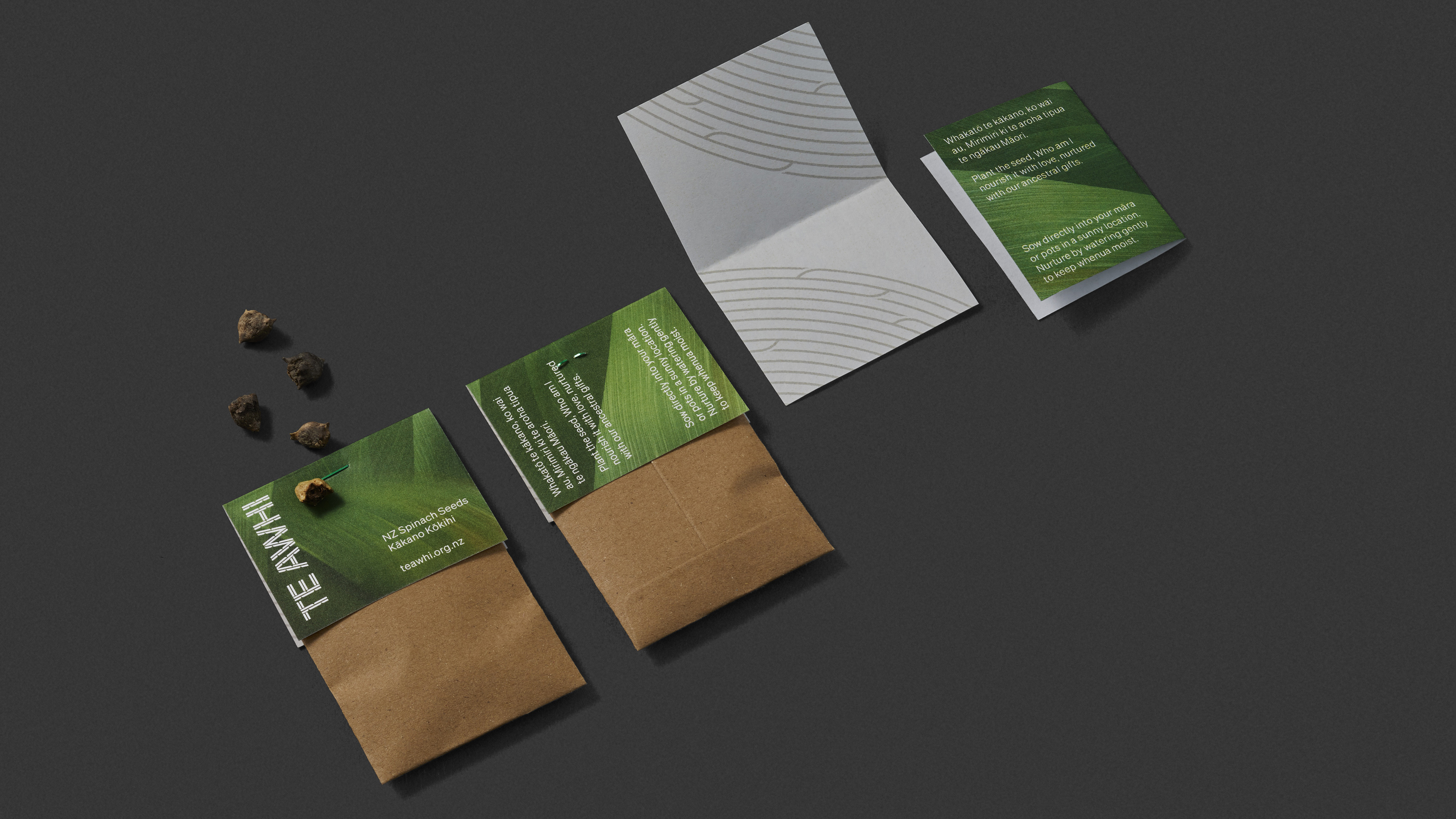
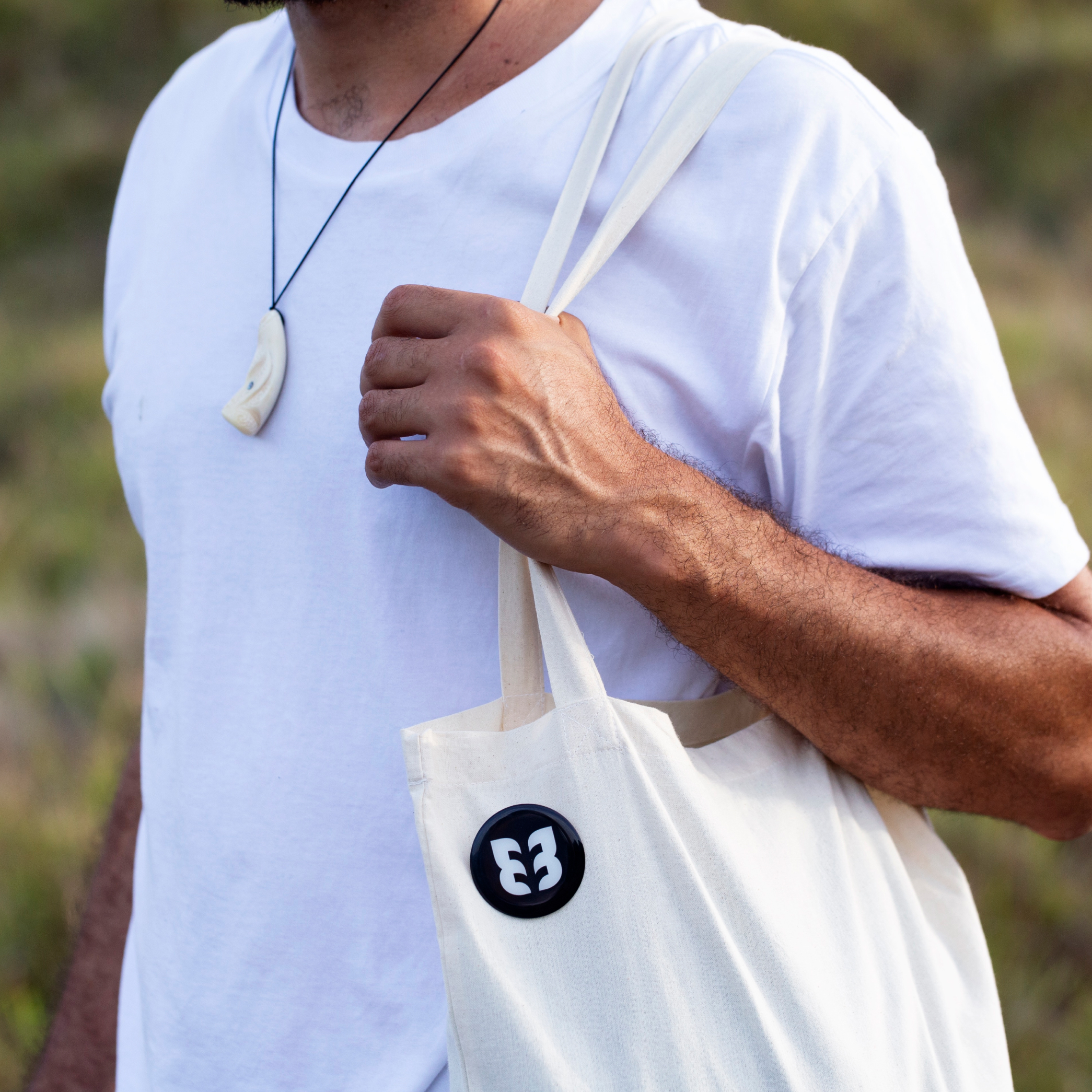
Across the conference touchpoints, a wide range of items was designed. A take away pack was created featuring a pack of native seeds, brochures, sticker sheets with affirming Māori phrases, and branded cards that share the organisations whakatauki. 500 packs were created and given out during the conference, all with the purpose of highlighting aspects of a holistic and healthy existence from a Māori perspective.
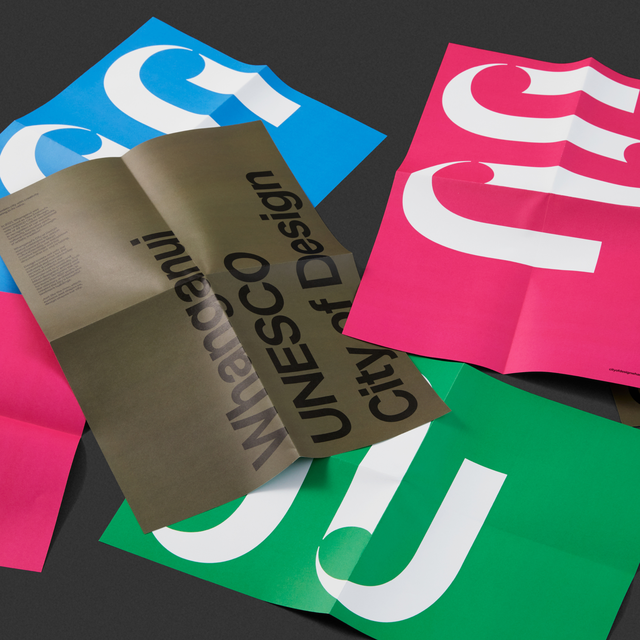
Large banners and brand table cloths were printed for the expo stand, along with posters and research sheets that displayed Māori wellbeing methods.
This was an opportunity to offer up a clear Māori vision for the prosperity and health of our people.
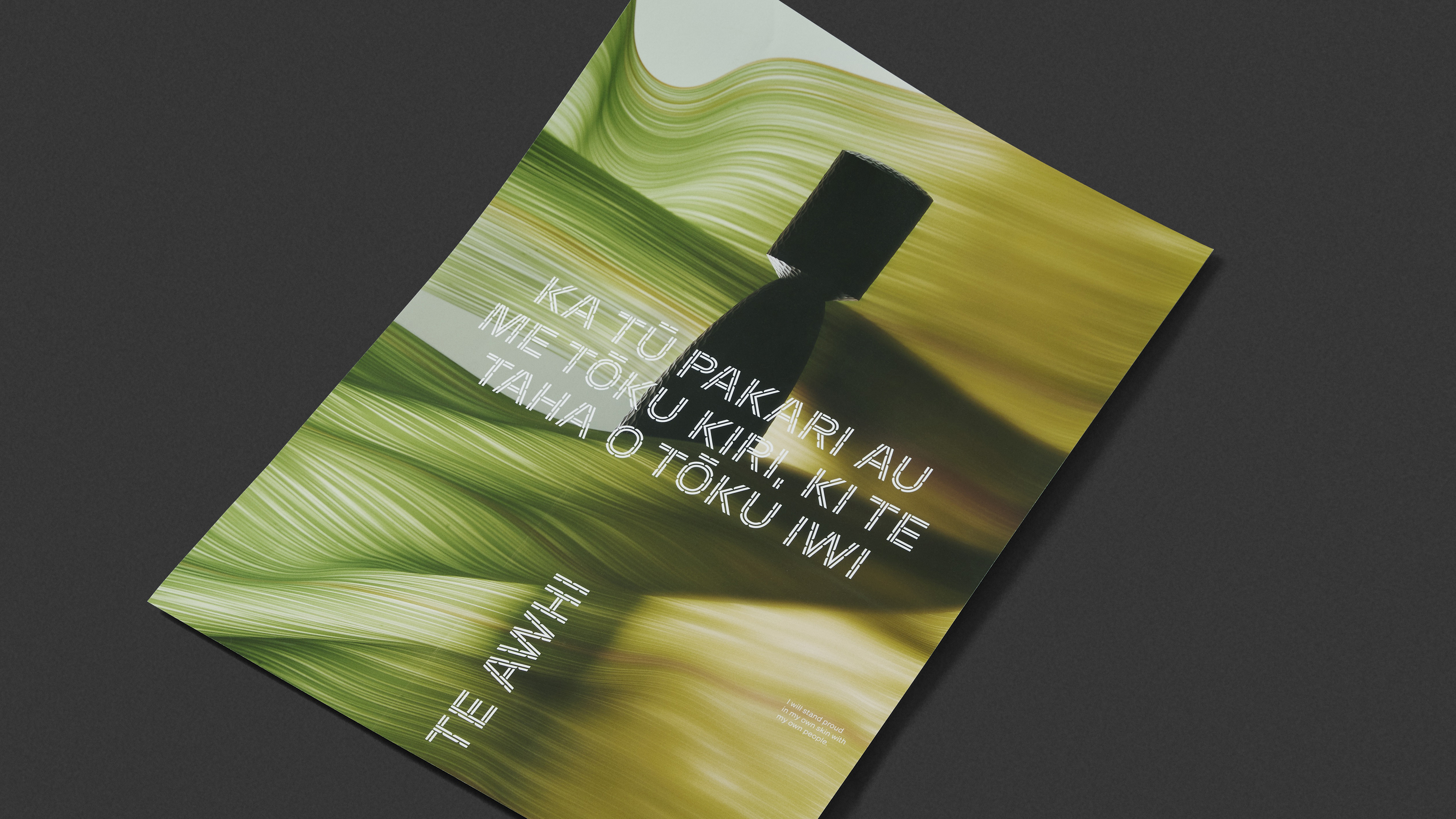

To make the metaphor more visually apparent, we created a custom display typeface for Te Awhi inspired by Pā Harakeke. This typeface formed the heart of the new brand. It is used as the Te Awhi wordmark, and also flows through their services: Awhi Mai, Awhi Atu, Awhi Whānau and Awhi Ora.
When used in sentences, the typeface itself becomes a blooming Pā Harakeke, and the character of the letterforms plays a critical role in allowing Māori-in-need to proudly see themselves reflected within a health care system that more often than not is alienating and misaligned culturally.
Throughout the brand, the typeface is paired with calming photos of flax and a colour and paper stock palette of warmer creams and earthy greys and rolled out across all print pieces, the website, staff uniforms and physical signage.
It is a typeface that reflects nature. It is a typeface that helps vulnerable Māori to feel they have access to healthcare through the welcoming and familiar queues of their culture.